This rolex ceramic bezel guide explains how to review Submariner, GMT-Master II, and Daytona-style ceramic bezels through marker printing, color consistency, 12 o’clock alignment, font depth, ceramic gloss, bezel insert fit, and QC photos before shipping.
Quick Navigation
What Is a Rolex Ceramic Bezel?
First, a ceramic bezel is the hard glossy insert that sits around the crystal on many modern Rolex-style sports watches. It can carry a diver minute scale, a 24-hour GMT scale, or a fixed tachymeter scale, depending on the model family.
However, the bezel is not only decoration. It frames the dial, controls the first front-view impression, and often makes small alignment issues easier to notice. Therefore, bezel review should always connect with dial alignment, crystal clarity, case proportions, bracelet finishing, clasp details, and crown shape.
For background on the original material concept, Rolex’s official page about the Cerachrom bezel explains the two-colour ceramic insert used on GMT-Master II models. In this guide, that background is used only to explain why color split, gloss, and marker clarity deserve careful visual checking.
On a Submariner-style watch, the bezel creates the classic diver look. Meanwhile, on a GMT-Master II-style watch, it carries the travel-time identity through color and 24-hour markers. On a Daytona-style watch, the ceramic tachymeter bezel gives the chronograph dial a sharper racing frame.
Why Ceramic Bezel Details Matter Before Ordering
Above all, the bezel sits at the most visible edge of the watch face. A slightly shifted top marker can make the whole dial look unsettled. Likewise, weak printing can make a clean case shape feel less refined.
Moreover, ceramic bezels use strong contrast. Black ceramic with light markers, blue-and-red Pepsi colors, black-and-blue Batman colors, green-and-black Sprite colors, and brown-and-black Root Beer tones all reveal printing and color control quickly.
Because of that, one product image is not enough. A product page shows the style direction, while QC photos show the exact watch prepared before dispatch. This difference matters for bezel alignment, dial centering, case profile, crystal clarity, bracelet finish, clasp condition, and crown details.
For broader model browsing, the main replica watches page connects Rolex-style options with super clone watches, QC photos, factory version comparison, and order support.
Key Details to Check on a Ceramic Bezel
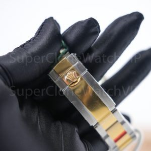
First, check the 12 o’clock alignment. On Submariner and GMT-Master II-style watches, the top triangle or top marker should sit naturally with the dial center, case center, and crown direction. If the marker leans left or right, every front photo may look slightly off.
Next, review marker printing. Submariner minute markers should look clean and evenly spaced. GMT numerals should follow the bezel curve without odd rotation. Daytona tachymeter text should stay sharp, especially around dense scale sections.
At the same time, font depth matters. Printing that appears too thick can make the bezel look heavy. However, printing that appears too thin can weaken the sports-watch character. A balanced version should look crisp at normal viewing distance and still hold up in close-up photos.
Finally, inspect ceramic gloss and insert fit. The surface should not look cloudy, wavy, or uneven in every image. Also, the ceramic insert should sit evenly around the crystal and outer metal edge, without obvious gaps or tilted areas.
Marker Printing
Look for clean numerals, even spacing, stable line weight, and no broken marker edges.
Color Consistency
Pepsi, Batman, Sprite, and Root Beer bezels need controlled transitions and balanced tones.
Insert Fit
The ceramic insert should sit evenly near the crystal and outer bezel edge.
Submariner, GMT-Master II, and Daytona Bezel Differences
Each Rolex-style sports model uses the bezel differently. Therefore, the same QC method should not be applied too loosely. A Submariner bezel, GMT ceramic bezel, and Daytona tachymeter bezel all require a different visual priority.
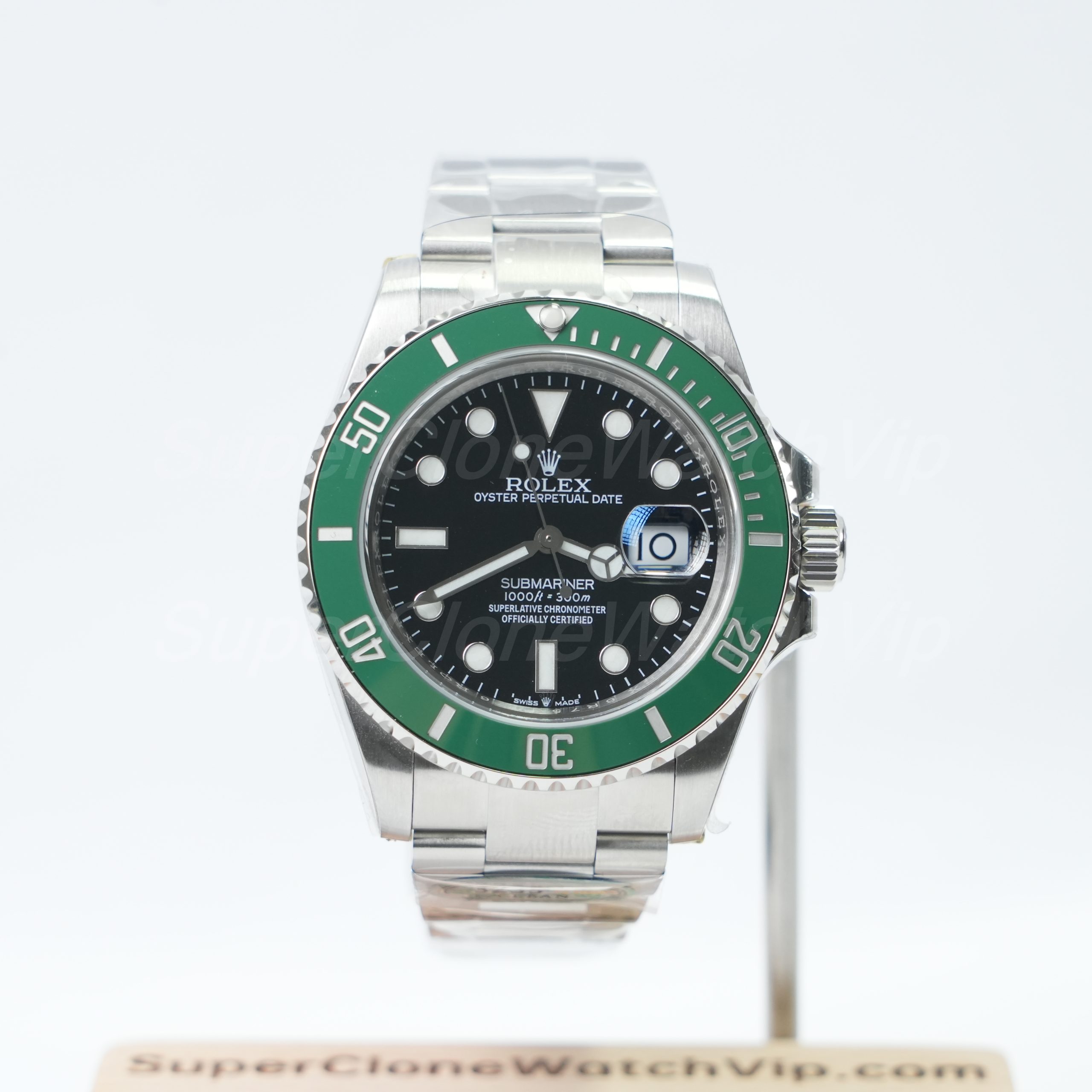
A Submariner-style bezel is usually reviewed through its 60-minute scale. The 12 o’clock triangle, pip position, first 15-minute marker section, and bezel-to-crystal edge are the most important areas.
A GMT-Master II-style bezel is reviewed through its 24-hour scale and color split. Pepsi, Batman, Sprite, and Root Beer designs place more pressure on color control, font balance, and split-line neatness.
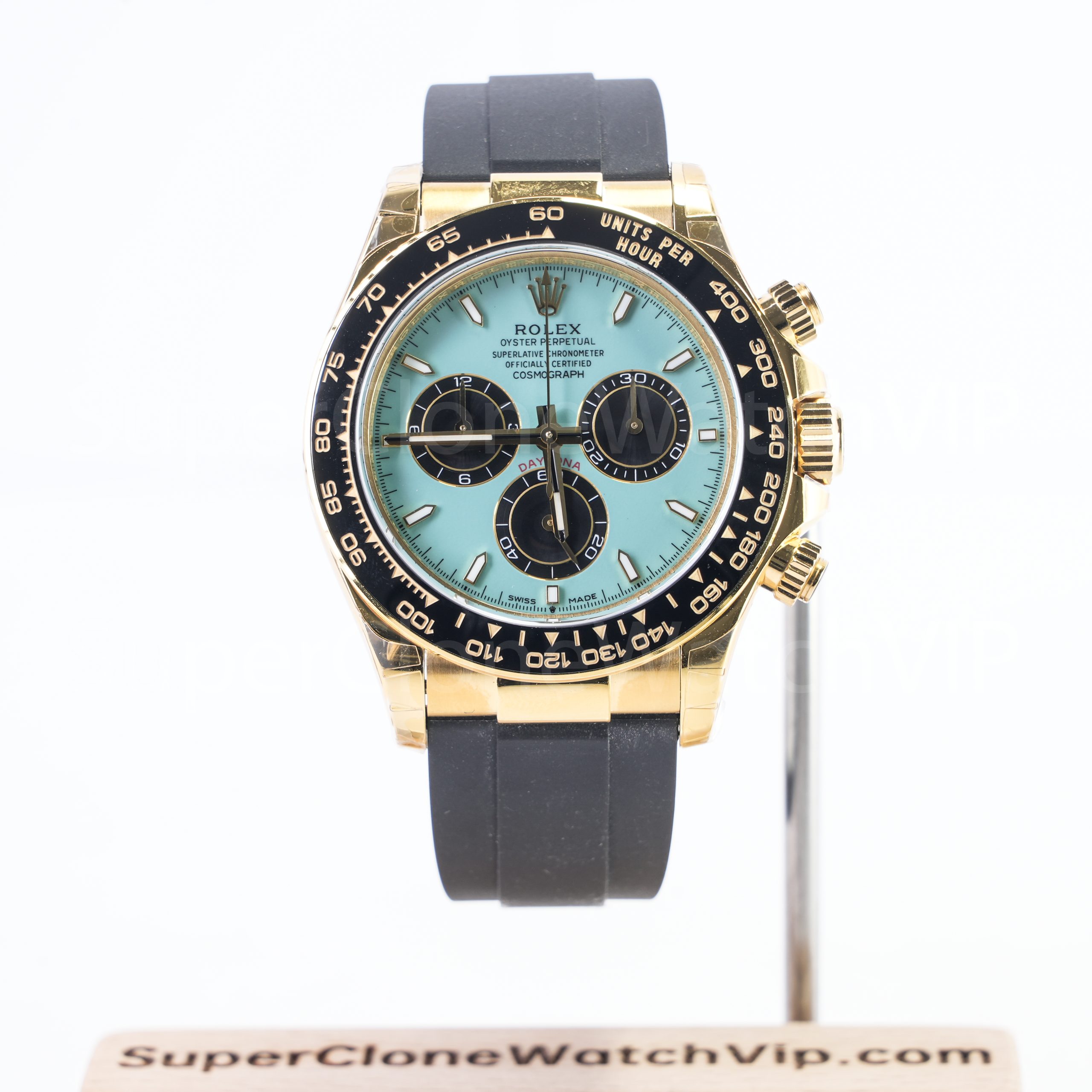
A Daytona-style ceramic bezel works differently because it is fixed and uses a tachymeter scale. Therefore, the key checks are text clarity, scale spacing, ceramic gloss, and how the bezel frames the chronograph dial.
Submariner Bezel Notes
For Submariner-style options, the triangle at 12 o’clock should look centered and calm. In addition, the pip should not appear shifted inside the triangle. The first 15-minute scale should also look clean because it carries the densest marker section.
Meanwhile, black and colored Submariner bezels need slightly different checks. A black ceramic bezel should look deep and smooth. A colored bezel should stay controlled under several light angles, not overly bright or washed out.
For model comparison, the Rolex Submariner replica watches collection is the most relevant internal page for diver-style ceramic bezel options.
GMT Ceramic Bezel Notes
For GMT-Master II-style options, the color split is the main identity. Pepsi should show a controlled red-and-blue transition. Batman should keep a balanced black-and-blue contrast. Sprite should show a stable green tone. Root Beer should keep warm brown color without turning too flat or orange.
Also, the 24-hour numerals should look consistent across both color halves. If the font looks heavier on one side, or the split line makes numbers look messy, the bezel may weaken the full front view.
For color and bracelet comparison, the Rolex GMT-Master II replica watches collection is a strong next step.

Daytona Tachymeter Bezel Notes
For Daytona-style watches, the fixed ceramic tachymeter bezel should be reviewed for scale clarity. The 60, 100, 200, 300, and 400 areas should not look muddy, broken, or unevenly spaced.
In addition, the bezel must work with the chronograph dial. Sub-dial spacing, hand position, case thickness, crystal clarity, and strap or bracelet choice all affect the same visual result.
For tachymeter bezel comparison, the Rolex Daytona replica watches collection is useful for black ceramic, Panda-style, gold-tone, and Oysterflex-style models.
Details on Super Clone Watches
In super clone watches, the ceramic bezel should be judged as part of a full version package. A strong model should show balanced case proportions, clean dial printing, tidy bezel execution, clear crystal, smooth bracelet finishing, and a clasp that matches the overall build level.
However, a factory name should not replace visual review. One version may have stronger ceramic color control, while another may show better bracelet finishing or crystal clarity. Therefore, the exact model and current QC photos should guide the final decision.
Movement option also needs a practical view. Movement choice may affect case thickness, crown feel, hand operation, date behavior, or chronograph layout. Even so, it does not automatically improve bezel printing, ceramic gloss, or insert fit.
For model-based version comparison, the Super Clone Watch Factory Guide helps organize factory version questions around model fit, visible details, QC photos, and current availability.
Why Factory Version Cannot Be the Only Decision
First, small updates can happen between batches. A version discussed months ago may not match current stock. Because of that, current QC photos are more useful than old screenshots or copied comments.
Second, each model has different visual priorities. A factory that performs well on a Submariner-style case may not lead on every GMT color split. Likewise, a strong Daytona case still needs close review around tachymeter font depth.
Finally, visible quality depends on the exact piece. Bezel alignment, insert seating, bracelet brushing, clasp tightness, crown details, and crystal clarity should all be checked before shipping approval.
QC Photo Checklist Before Shipping
Before shipping, QC photos should answer clear visual questions. The review should stay structured, because one reflection can create a false concern. However, repeated imbalance across several photos deserves attention.
Use this checklist to review bezel details and related watch areas before final approval.
- Check 12 o’clock bezel alignment against the dial center, crown, and case shape.
- Review Submariner triangle position, pip placement, and first 15-minute marker section.
- Compare GMT ceramic bezel color split on Pepsi, Batman, Sprite, and Root Beer styles.
- Inspect Daytona tachymeter printing around 60, 100, 200, 300, and 400 areas.
- Look for clean marker printing without broken edges, uneven thickness, or blurred numerals.
- Check ceramic gloss under direct light and softer light.
- Confirm the bezel insert sits evenly near the crystal and outer metal edge.
- Review dial alignment, hour markers, hands, logo placement, and date window position.
- Compare case proportions from straight-front and side-profile images.
- Inspect bracelet brushing, polished center links when present, and end-link fit.
- Check clasp finishing, safety lock shape, bracelet link spacing, and closure feel.
- Review crystal clarity for haze, dust, distortion, or unusual reflections.
- Confirm crown details, crown guard spacing, and side case alignment.
- Confirm model, factory version, movement option, QC process, contact channel, and shipping details before payment.
For a clearer review workflow, the Super Clone Watch QC Process explains how pre-shipping photos help check dial, hands, bezel, case, bracelet, clasp, and visible condition before dispatch.
Front Photo Review
A straight front image is the best starting point. The watch should sit level, and the bezel marker should align naturally with the dial and case. If the photo is tilted, one extra straight photo can prevent a wrong judgment.
At the same time, dial alignment should be checked. A centered bezel with a shifted dial still creates an uneven face. Therefore, logo placement, hour markers, hands, date window, and rehaut position should be reviewed together.
Angled Photo Review
Angled photos help show ceramic gloss, insert height, crystal edge, and case side profile. However, reflections can become stronger at an angle. Therefore, these images should support the front photo rather than replace it.
For Daytona-style watches, angled photos show how the tachymeter bezel meets the crystal. For GMT and Submariner-style watches, they help reveal insert seating and side profile balance.
Which Ceramic Bezel Style Fits Different Needs?
A useful ceramic bezel guide should not stop at technical details. It should also connect the bezel style with daily wear, wrist presence, outfit style, and QC priorities. Therefore, the right choice depends on both appearance and inspection difficulty.
For a quiet daily sports look, a black Submariner-style ceramic bezel is usually the safest direction. It has strong model recognition, simple color control, and clear QC points. Still, the 12 o’clock triangle, pip, minute scale, and insert seating must be checked carefully.
For a more colorful travel-watch look, GMT-Master II-style bezels are stronger. Pepsi brings the most classic red-and-blue identity. Batman feels more restrained and modern. Sprite feels unusual because of the green-and-black left-crown layout. Root Beer feels warmer and more mature, especially with two-tone styling.
For a sportier chronograph look, Daytona ceramic bezels are better. The fixed tachymeter scale creates a sharp frame around the dial. However, this style requires careful checking of print clarity, sub-dial balance, pusher details, crystal edge, and strap or bracelet integration.
Quick Model Choice Guide
| Black Submariner | Best for clean daily wear, simple sports styling, and easy outfit matching. |
| Green or Blue Submariner | Best for a stronger color accent while keeping the classic diver-style case. |
| Pepsi / Batman GMT | Best for a recognizable GMT look with stronger color identity and travel-watch styling. |
| Sprite / Root Beer GMT | Best for a less common GMT direction with more personality and stronger visual contrast. |
| Daytona Ceramic | Best for a chronograph-style look with tachymeter bezel detail and sport-luxury presence. |
Related Models and Order Notes
Different ceramic bezel models create different wearing impressions. Therefore, model selection should begin with style, wrist preference, dial complexity, and QC comfort. Color alone should not make the final decision.
A Submariner-style watch is the cleanest ceramic bezel direction. It works well for daily wear, casual outfits, and a straightforward sports-watch profile. Meanwhile, green or blue versions add personality but need closer color review.
A GMT-Master II-style watch gives the strongest color identity. Pepsi, Batman, Sprite, and Root Beer bezels each create a different mood. Therefore, color split, font weight, bracelet pairing, and crown layout should be checked before approval.
A Daytona-style watch works best when a chronograph dial is part of the desired look. The ceramic bezel should frame the sub-dials cleanly. If the tachymeter scale looks weak, the full watch may lose its sharpness.
For a wider product path, the Rolex replica watches collection helps compare Submariner, GMT-Master II, Daytona, Datejust, Day-Date, and other Rolex-style categories in one place.
Helpful Rolex Model Guides
The next step should connect this bezel guide with model selection, QC review, factory version comparison, and order preparation. These related pages help keep the reading path practical instead of ending at general information.
Rolex Replica Watches
Compare Rolex-style model families, including Submariner, Daytona, GMT-Master II, Datejust, Day-Date, and more.
Submariner Ceramic Bezel
Review diver-style bezel layouts, black and colored ceramic tones, Oyster bracelet fit, and date/no-date directions.
GMT-Master II Bezel Colors
Compare Pepsi, Batman, Sprite, Root Beer, Oyster bracelet, and Jubilee bracelet visual directions.
Daytona Tachymeter Bezel
Check fixed ceramic tachymeter scales, chronograph dial balance, Oysterflex straps, and case profile.
QC Process
Use pre-shipping photo checks to review bezel alignment, dial details, bracelet finishing, clasp, and visible condition.
Factory Guide
Compare factory version direction by model fit, visible finishing, current availability, and QC photo needs.
FAQ
These questions focus on ceramic bezel checks, color split review, factory version comparison, and QC photo decisions before shipping.
What should be checked first on a Rolex ceramic bezel?
First, check the 12 o’clock alignment. The top marker should sit naturally with the dial center, crown position, and case shape. After that, review marker printing, ceramic gloss, color consistency, and insert fit. This order keeps the QC review practical and avoids overreacting to small reflections.
Are Pepsi, Batman, Sprite, and Root Beer bezels checked the same way?
Not exactly. All GMT ceramic bezels need clean 24-hour numerals and proper alignment. However, Pepsi needs red-and-blue transition checks, Batman needs black-and-blue contrast checks, Sprite needs green tone and left-crown layout review, and Root Beer needs warm brown color control.
What makes a Daytona ceramic bezel different from a Submariner bezel?
A Daytona ceramic bezel usually has a fixed tachymeter scale, while a Submariner bezel uses a diver-style minute scale. Therefore, Daytona checking focuses on tachymeter print clarity and dial balance. Submariner checking focuses more on triangle alignment, pip placement, and first 15-minute marker spacing.
Can factory version alone confirm bezel quality?
No. Factory version helps narrow the comparison, but it cannot confirm the exact bezel alignment, insert fit, marker printing, or ceramic gloss of the watch prepared for dispatch. Therefore, current QC photos remain necessary before final approval.
Why do ceramic bezel colors look different in QC photos?
Lighting, phone cameras, viewing angle, and reflections can change ceramic color in photos. Therefore, one image may make blue look darker, red brighter, or green stronger. A better review uses several angles and checks whether the color remains controlled overall.
Does a Submariner-style ceramic bezel prove water resistance?
No. A diver-style bezel does not prove water resistance. Case construction, crown fit, gasket condition, handling, and testing all matter. Therefore, water exposure should not be assumed from the design. Any water-use question should be confirmed clearly before payment.
Final Order Notes
Overall, a ceramic bezel should be reviewed as both a visual detail and a structural detail. It shapes the first impression, but it also connects with dial alignment, crystal clarity, case proportions, bracelet finishing, clasp fit, and crown details.
Therefore, a strong order review should not depend on one attractive image. It should compare the relevant collection page, current factory version, movement option, and QC photos before payment.
To make the final step clearer, follow these three actions:
- Choose the exact model family, bezel color, bracelet type, and preferred version direction.
- Review QC photos for bezel alignment, marker printing, color consistency, gloss, dial centering, crystal clarity, bracelet finishing, and clasp fit.
- Confirm the model, factory version, movement option, QC process, contact channel, and shipping details before payment.
Review the Collection, QC Process, and Support Before Payment
Before choosing a ceramic bezel model, compare the relevant Rolex collection, confirm current factory version details, and use the QC Process to review the exact watch before dispatch.