When you look at your wrist, do you want strong numeral navigation, or should the dial step behind the rest of your outfit? That is the real Air-King vs Oyster Perpetual decision. The Air-King leads with a black instrument-style dial, prominent 3-6-9 markers and a visible minute scale. The Oyster Perpetual removes most of that visual information and lets case size and dial color set the mood.
Choose the Air-King when a daily watch should add energy and identity. Choose the Oyster Perpetual when one watch must move quietly between work, casual clothing and weekends. The sections below turn that difference into specific reading, color, fit, wardrobe and QC checks rather than a general popularity ranking.
Instrument Dial or Visual Calm?
The Air-King is the more assertive starting point. Large Arabic markers at 3, 6 and 9 sit inside a dial that also carries prominent minute numerals. The green seconds hand and the colored logo details add another layer of contrast. Nothing about the face is accidental or neutral: it is designed to be noticed and read as an instrument.
The Oyster Perpetual uses the opposite strategy. Baton markers, a smooth bezel and a no-date layout create more open space. Its personality comes mainly from proportion and dial color rather than from printed information. A black or silver version can disappear into a conservative wardrobe, while a brighter color can become the focal point without adding more scales or complications.
This makes the first decision simple. Open the Air-King collection if you want the watch to contribute a graphic identity. Open the Oyster Perpetual collection if you want to choose the amount of attention through color and size.
The ten-second screen test
View one straight-on image of each model at the same size for ten seconds. Then look away. If you remember numerals, minute figures and the green seconds hand, the Air-King is doing what you want. If you remember the overall color and clean circle of the dial, the Oyster Perpetual is the more natural direction.
Numerals, Minute Track and Reading Speed
The Air-King supplies more navigation points. Its large 3-6-9 hour markers orient the eye, while the minute numerals make exact minute positions easier to locate. Rolex’s official Air-King page also identifies the large hour markers and prominent minutes scale as defining visual elements. This is useful for someone who actively reads the dial rather than treating the watch mainly as jewelry.
More guidance does not always mean a faster first glance. The eye has more objects to sort, especially in a small photo or from an oblique angle. The Oyster Perpetual usually gives a quicker hour-and-minute impression because its baton markers and empty space reduce visual competition. It is the cleaner choice for someone who checks the time in a meeting, while walking or while moving between screens.
Use a one-second test before choosing. Place equally sized front images side by side, glance once, and write down the time you saw. Repeat from a slight angle. The model that produces fewer corrections is faster for your eyes. Do not assume that the busier dial is automatically more legible or that the simpler dial is automatically more informative.
Low-light images should be treated separately from daylight reading. Ask for an evenly lit front photo first; reflections, camera sharpening and heavy contrast can make either dial look clearer than it is in ordinary use.
Color Choices and Attention Level
Air-King color is largely fixed by its black-dial identity. The visual interest comes from contrast: white numerals, the green seconds hand and small colored accents. That consistency makes it easy to understand, but it also means you cannot reduce its information load by choosing a quieter dial.
The Oyster Perpetual gives more control over attention. Neutral black and silver are the easiest long-term choices because they repeat the colors already present in steel cases, dark shoes, belts, office trousers and outerwear. Blue can remain versatile while showing more personality. Brighter colors are better treated as deliberate wardrobe accents rather than automatic everyday options.
Do not choose color from a single studio image. Ask for a straight dial photo in neutral light and another image taken at a slight angle. Metallic and sunburst surfaces can shift significantly under direct lighting, while black can look grey when the crystal reflects a bright room.
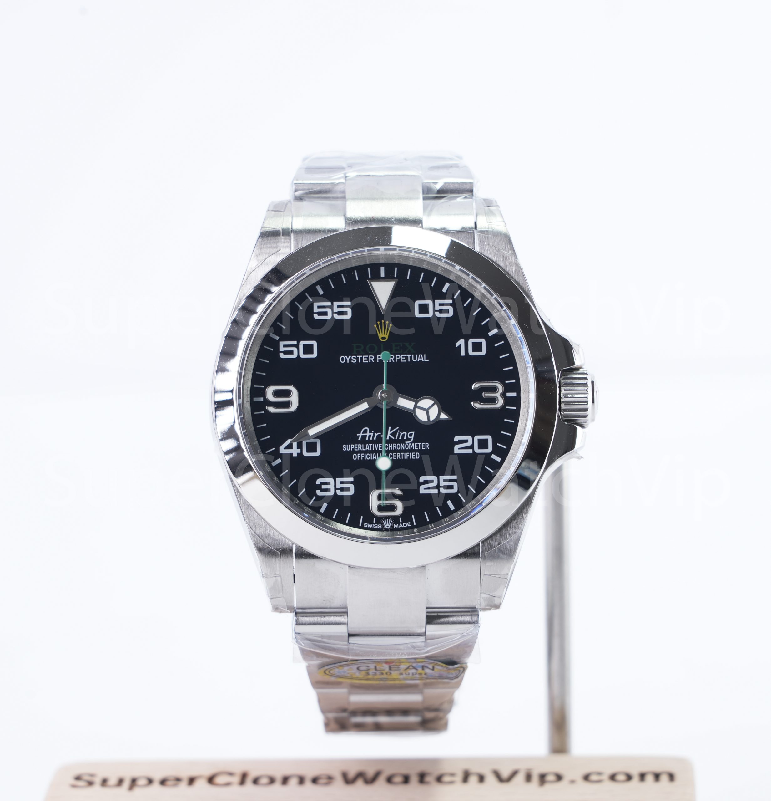 Air-King 126900 Black Dial 40mm
Best when the dial should supply the personality through numerals, minute figures and contrast.
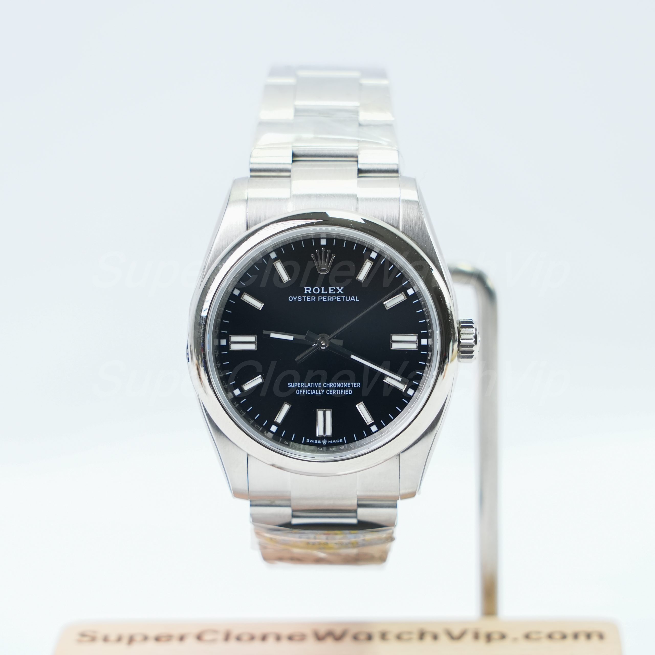 Oyster Perpetual Black Dial 36mm
 Best when low color risk, classic scale and a quiet office-friendly face matter most.
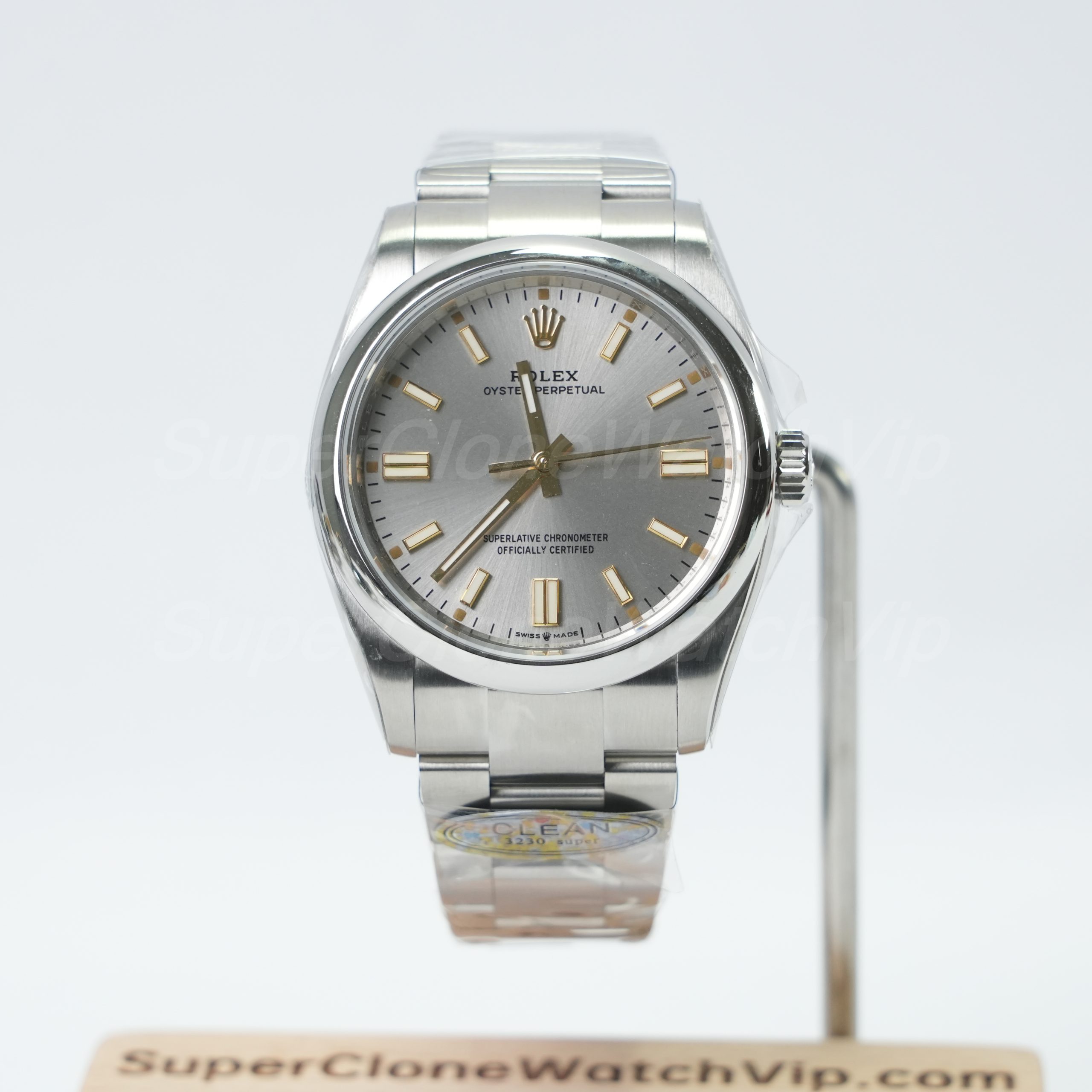 Oyster Perpetual Silver Dial 41mm
 Best when a larger modern presence is wanted without turning the dial into a strong color statement.
Case Proportion and Wrist Balance
The current Air-King direction is a clear 40mm proposition, so the decision is less about choosing among several diameters and more about whether its visual mass suits your wrist. The dial already carries substantial information; on a narrower wrist, that combination can make the watch feel larger than the number alone suggests.
Oyster Perpetual sizing gives more room to tune the effect. A 36mm version can look deliberate and classic rather than small, especially when the dial is black or another restrained color. A 41mm version keeps the simple layout but adds more visible surface area. It is useful for larger wrists or for buyers who like a modern case presence without an instrument-style face.
Thickness should be judged as a visual and physical feel, not guessed from front photos. Ask for a side profile at crown level. The Air-King’s stronger case treatment and crown-guard area can read as more tool-like, while the Oyster Perpetual presents a cleaner side silhouette. The exact piece should still be checked because camera angle can exaggerate or hide height.
Use wrist width rather than wrist circumference alone. A flat, wide wrist can carry a larger face differently from a round wrist with the same circumference. The watch size guide helps narrow the 36mm, 40mm and 41mm direction, but a straight wrist photo remains the best final comparison.
| Decision Dimension | Air-King | Oyster Perpetual | Use This Test |
|---|---|---|---|
| Information load | High: large numerals, minute numerals and multiple color accents. | Low: baton markers and open dial space. | Pick the dial you can view repeatedly without feeling visually tired. |
| Color intensity | Mostly controlled by black, white, green and yellow contrast. | Can range from neutral black or silver to stronger color choices. | Compare the dial with three outfits you wear every week. |
| Styling difficulty | Moderate; easiest with casual, technical and relaxed smart-casual clothing. | Low with neutral colors; rises when the dial becomes brighter. | Choose the watch that works with normal clothes, not one special outfit. |
| Read speed | Strong minute navigation, but the eye must process more elements. | Usually faster for a simple hour-and-minute glance. | Run the one-second time-reading test twice. |
| Personality expression | High through a fixed, recognizable dial identity. | Adjustable through size and dial color. | Decide whether personality should come from graphics or color. |
| Size and thickness feel | A 40mm, more tool-like visual presence. | 36mm can feel classic and restrained; 41mm feels more modern and visible. | Request a straight wrist image and a crown-level side image. |
| Function | Time-only display in the model compared here; no date window. | Time-only display in the models compared here; no date window. | Choose by reading style and appearance, not by extra complication. |
| Bracelet or strap path | The linked configuration uses an Oyster-style bracelet that supports the sports character. | The linked configurations use Oyster-style bracelets that reinforce the clean case shape. | Confirm the exact bracelet and clasp shown on the product page and QC set. |
| Daily wear | Best when the watch is allowed to be a visible part of the outfit. | Best when the watch must cover many settings with less visual interruption. | Count how many days last week each model would have matched. |
| Formality | Works best in casual and relaxed professional environments. | Neutral dials are easier in conservative workplaces and formal clothing. | Use your strictest work outfit as the deciding outfit. |
| QC difficulty | Dense printing creates more alignment and spacing points to inspect. | Simple layout makes uneven markers, hand alignment and surface flaws easier to notice. | Request a level, high-resolution front photo before approval. |
| Best suited to | A buyer who enjoys visual stimulation and a fixed technical identity. | A buyer who wants adjustable color, proportion and lower styling effort. | Choose the description that sounds like your normal week, not your idealized weekend. |
Workwear, Casual Clothing and Weekend Use
Conservative or client-facing work
A neutral Oyster Perpetual is the lower-risk option. The absence of large numerals lets the watch sit behind a shirt, jacket or knitwear rather than competing with it. The 36mm black-dial path is especially controlled; the 41mm silver option works when more wrist presence is needed without stronger graphics.
Casual workwear and relaxed offices
The Air-King becomes easier to use when denim, overshirts, polos, field jackets or dark casual clothing are already part of the week. Its dial adds a deliberate technical accent. It can still work with a blazer, but it will remain a visible design choice rather than disappearing under the cuff.
Weekends and travel days
For a weekend watch that should feel different from office accessories, the Air-King has the stronger personality. For a one-watch trip where clothing may range from T-shirts to a dinner jacket, a neutral Oyster Perpetual requires less planning. Bright Oyster Perpetual colors can be excellent for weekends, but they should be tested against the actual travel wardrobe rather than judged only as isolated product images.
The seven-outfit audit
List seven outfits from the previous week. Mark each as “watch leads” or “watch blends.” If five or more outfits benefit from a visible dial, lean Air-King. If five or more need the watch to blend, lean Oyster Perpetual. This is more reliable than choosing from a single favorite product shot.
Dial-Printing and Hand-Alignment QC
These two dials fail visually in different ways. The Air-King has more printed elements, so spacing and parallel alignment matter. The Oyster Perpetual has fewer elements, so one tilted baton or an uneven hand relationship can become the main thing the eye notices.
Air-King front-photo checks
- Check that the 3, 6 and 9 markers sit squarely and share a consistent visual height.
- Inspect the minute numerals from 05 through 55 for even spacing, clean edges and no obvious rotation.
- Compare the triangular 12 o’clock marker with the central hand stack; a tilted camera can create false misalignment, so request a level image.
- Look at the green seconds hand against the printed logo details and confirm that color and hand finish appear clean under neutral lighting.
- Check that the minute and hour hands clear the markers cleanly in several positions rather than judging only the standard product-photo time.
Oyster Perpetual front-photo checks
- Follow the baton markers around the dial and look for one marker that leans or sits closer to the minute track.
- Inspect the dial surface for dust, uneven finishing or a color patch that appears only at one angle.
- Check the relationship between the minute hand, hour hand and center pinion in a straight-on image.
- Compare the 6 and 12 o’clock double markers with the case centerline; the simple dial makes small asymmetry easy to notice.
For both models, ask for one straight front image, one crown-side profile, one bracelet-and-clasp image and a short video or moving-light clip when available. The Super Clone Watch QC Process shows the photo angles and visible details that support this review.
Ask for the Two Photos That Settle This Comparison
Send one Air-King link and one Oyster Perpetual link. Request level dial photos at similar scale plus crown-side profiles. That pair reveals information load, color response and wrist thickness far better than two unrelated promotional images.
A Personality-Based First-Watch Test
Do not answer these questions as a collector planning a future collection. Answer them as the person who will wear this watch on an ordinary Tuesday.
1. What do you notice first?
Numbers and navigation: one point to Air-King. Overall color and shape: one point to Oyster Perpetual.
2. How strict is your workplace?
Relaxed or creative: Air-King can work naturally. Conservative or client-facing: neutral Oyster Perpetual gets the point.
3. Do you enjoy visual stimulation?
Yes, and plain dials become boring: Air-King. No, repeated detail becomes tiring: Oyster Perpetual.
4. Where should personality come from?
Fixed graphic identity: Air-King. Changeable color and proportion: Oyster Perpetual.
5. What happens in a one-second glance?
If minute numerals help, Air-King scores. If open space gives a cleaner answer, Oyster Perpetual scores.
6. Which regret feels worse?
“My watch is too plain”: Air-King. “My watch draws too much attention”: Oyster Perpetual.
Four to six Air-King points: your first daily watch should probably provide visual stimulation rather than avoid it. Confirm the 40mm wrist balance and inspect dial printing before approval.
Four to six Oyster Perpetual points: you value low styling effort, calmer reading and the ability to tune color or size. Start with black or silver if long-term versatility matters most.
A three-three result: do not broaden the search. Compare the Air-King 40mm with a neutral Oyster Perpetual in the size closest to your wrist preference. The straight-on dial and side-profile photos should break the tie.
FAQ: Air-King vs Oyster Perpetual
Is Air-King dial too busy for daily wear?
Not for a wearer who enjoys visible numerals and active dial navigation. It may feel busy when the watch must disappear in formal clothing or when repeated visual detail becomes tiring. Use the ten-second screen test and the seven-outfit audit before deciding.
Which Oyster Perpetual color is easiest to own long term?
Black and silver are the lowest-risk choices because they repeat neutral colors already present in steel bracelets and common workwear. Blue can also remain versatile with more character. A brighter dial is better when it already matches several outfits you wear regularly.
Which model reads faster at a glance?
The Oyster Perpetual usually gives a faster simple hour-and-minute impression because the dial has less visual competition. The Air-King can be faster for people who use its minute numerals to locate an exact minute. A one-second side-by-side reading test is more useful than a universal claim.
What printing details should be checked on Air-King?
Inspect the 3-6-9 markers, the 05-to-55 minute numerals, logo position, text sharpness and spacing around the dial. Use a level front photo so camera tilt does not create a false alignment problem, then check the green seconds hand and central hand stack.
Which is more suitable for a conservative workplace?
A neutral Oyster Perpetual, especially black or silver, is easier because the dial carries less printed information and attracts less attention. The Air-King can still work in a relaxed office, but its numerals and minute scale remain a visible style statement.
Finish With the Visual-Stimulation Score
Choose the Air-King when your score shows that you enjoy information, contrast and a dial that actively participates in the outfit. Your next action is not another general comparison: request a level dial close-up, confirm the 40mm wrist balance and inspect every printed numeral.
Choose the Oyster Perpetual when the score shows that visual calm, conservative workwear and low styling effort matter more. Narrow the choice to one size and one color, then check marker alignment and dial surface under neutral light.
Do not reopen the entire clone watches catalog until you have answered the opening question: should the dial lead the outfit, or recede behind it? Once that answer is fixed, the model choice becomes much harder to regret.