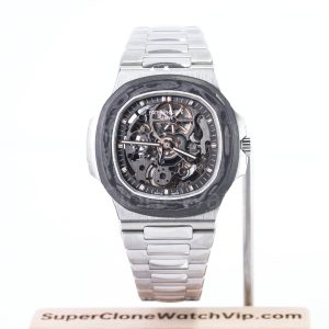
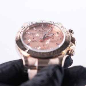
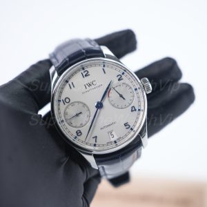
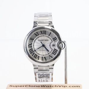
The best watch dial color for daily wear is usually black when maximum flexibility matters. However, dark blue comes very close and adds more life. White feels cleaner and often suits dressier clothing, while green creates the strongest identity with a narrower styling range. The practical choice depends on repeated clothing colors, case shape, bracelet brightness, wrist presence, and how the dial changes under normal light.
This guide suits a one-watch shortlist, a first colored-dial decision, or a comparison that has become too broad. Instead of ranking colors by popularity, it shows where each option works, where it becomes difficult, how Santos examples change the result, and what evidence matters before an order moves forward.
Quick Navigation
The Practical Answer
Choose by Repetition, Not by the Most Dramatic Product Photo
Black is the safest all-round direction. Dark blue offers almost the same range with more visible character. White is strongest for clean contrast and polished clothing. Green works best when the watch should act as a controlled accent rather than disappear into every outfit.
Black
Best for one-watch flexibility, dark wardrobes, travel, and low-effort matching.
Blue
Best for neutral wardrobes that need more depth without a strong styling burden.
Green
Best for simple clothing, an existing neutral watch, and a deliberate wrist accent.
White
Best for crisp shirts, dress-casual clothing, visual clarity, and lighter seasonal outfits.
Start With the Week, Not the Watch Box
What Actually Makes a Dial Color Easy to Wear?
A dial becomes easy when it repeats well across ordinary clothing. One successful dinner outfit proves very little. By contrast, five normal combinations across work, weekends, travel, and changing light reveal whether the color has a lasting role.
The case and bracelet also change the answer. A black dial inside a polished square case can feel sharper than a blue dial inside a simple round watch. Likewise, a green dial framed by steel may feel calmer than the same color beside a matching bezel or strap.
A broad scan of clone watches can reveal available case families and dial directions. After that scan, the comparison should narrow to complete configurations rather than continue across unrelated models.
The Five-Outfit Test
Build five combinations from clothing already worn during a normal month. Include a work outfit, a relaxed weekend outfit, a dark evening outfit, a light seasonal outfit, and one travel or layered combination.
Next, place each dial color into those scenes. A color that works in four or five combinations belongs in a frequent-wear shortlist. A color that only works in one carefully coordinated outfit belongs in an accent-watch shortlist.
This test prevents product lighting from controlling the decision. It also keeps a strong color from being rejected simply because it does not match one formal outfit.
Wardrobe Temperature Matters More Than Exact Matching
Cool wardrobes usually contain black, charcoal, navy, white, pale blue, and clean grey. In that setting, black, blue, and white integrate with little effort. Green still works, although deeper forest tones tend to sit more naturally than bright emerald shades.
Warm wardrobes often rely on cream, camel, brown, tan, olive, burgundy, and textured neutrals. Here, green and white can become surprisingly easy. Blue remains useful, but a very bright blue may feel separate unless another cool element appears nearby.
Mixed wardrobes create the strongest case for black or dark blue. Both colors bridge warm and cool clothing without demanding another matching accessory. White can also bridge the two sides, yet it creates stronger visual contrast on the wrist.
Exact color matching is unnecessary. A navy dial does not need a navy shirt, and a green dial does not need a green belt. Instead, the watch should share the outfit’s level of brightness, formality, or visual temperature.
Dial Finish Changes the Color Through the Day
Flat black usually remains stable under indoor and outdoor light. That consistency reduces surprise and supports regular use. Glossy black adds reflection, while textured black can create more depth without changing the basic styling range.
Blue often changes more. A dark blue dial may look nearly black in a meeting room, then become clearly blue near a window. This movement adds interest, although one bright gallery image may overstate the daily effect.
Green can shift even more dramatically. Gradient edges, sunburst lines, and reflective surfaces may look reserved in shade and vivid under direct light. Accordingly, green needs neutral-light and angled views before it can be judged fairly.
White appears stable at first, yet tone still matters. Bright white feels crisp, silver-white feels cooler, and cream feels softer. Polished hands and markers may also disappear briefly when they reflect the same light as the dial.
Four Colors, Four Different Trade-Offs
Black, Blue, Green and White Dial Comparison
The table below gives a first filter. It focuses on repeated use rather than trend value. Because every watch design behaves differently, the final decision still needs case, bezel, bracelet, size, and QC review.
Black Dial: Maximum Range With the Lowest Styling Effort
Black works because it does not add another competing clothing color. It sits naturally beside black, charcoal, navy, brown, olive, cream, denim, and most outerwear. Therefore, a black dial often becomes the simplest answer for travel, mixed workdays, and a limited rotation.
Even so, black is not automatically quiet. A large bezel, broad polished case, bright bracelet, or strong white numerals can create substantial presence. An all-black dial and bezel can also join into one large dark surface, making the watch appear broader rather than smaller.
Black suits watches with several front details because the background organizes them. Date windows, exposed screws, sub-dials, minute tracks, and polished hands often look clearer against a dark base. However, glossy black can reveal dust and reflections in close images, so neutral light remains useful.
This route fits a wardrobe that changes often and a watch that should work without advance planning. It is less useful when the existing rotation already contains several dark dials or when the watch needs to supply visible color.
Black Works Best When
The watch must cross office clothing, dark casual layers, travel outfits, and evening use. It also makes sense when the case shape or bracelet already provides enough identity.
Blue Dial: The Strongest Middle Ground
Blue retains much of black’s flexibility but avoids a completely neutral result. Dark navy can look almost black indoors, then reveal clear color in daylight. This two-part character makes blue useful when regular wear still needs a little visual reward.
Grey, navy, white, tan, brown, and denim support blue with little effort. Exact matching is not required. In fact, a slightly different blue tone often creates more depth than a perfect shirt-and-dial match.
Shade matters, though. Navy is broadly wearable, royal blue creates a clearer focal point, and pale blue moves toward a seasonal or contemporary look. Gradient blue adds another variable because the center and edge may behave differently in normal light.
Blue suits a one-watch shortlist when black feels too predictable. It also works well as the next addition after a black dial because it changes the mood without demanding a different clothing system.
Blue Works Best When
The wardrobe already uses navy, grey, white, denim, or brown, and the watch should reveal more personality in daylight without becoming a strong accent.
Green Dial: Strong Identity With Clearer Conditions
Green is easier than its reputation suggests when the shade stays deep and the surrounding watch remains controlled. Forest, bottle, or black-green tones can look restrained indoors. By contrast, bright emerald and vivid gradient surfaces make the dial the main visual event.
Neutral clothing gives green room. Black, charcoal, cream, white, denim, brown, tan, and olive can all support it. Patterned shirts, several bright colors, or a matching green strap can push the result beyond daily flexibility.
Green performs especially well when the watch should lead a simple outfit. A plain knit, white shirt, black jacket, or cream overshirt can make the dial look intentional. However, the same watch may feel harder during formal weeks built around strict navy or charcoal tailoring.
This route suits an existing neutral rotation or a clear preference for color. It becomes less convincing when novelty is the only reason, especially if the product gallery provides the only imagined wearing scene.
Green Works Best When
Clothing stays mostly neutral, the watch is expected to supply the accent, and several normal outfits already support the dial without extra coordination.
White Dial: Clean Contrast and a More Open Wrist Appearance
White gives the dial a bright center. Dark hands, numerals, and tracks often read clearly, while the overall watch feels cleaner and more traditional. As a result, white works naturally with shirts, tailoring, knitwear, summer fabrics, and polished casual clothing.
The bright surface can also make the watch appear larger. A narrow bezel leaves more visible white space, and a square case extends that space toward the corners. Therefore, a white version may feel more present than a black version inside the same case family.
White does not need to feel formal. A steel bracelet and stronger case can move it into everyday territory, while leather and thin markers make it dressier. Cream, silver-white, and bright white also create different levels of warmth and contrast.
This route suits clean wardrobes, office use, lighter seasons, and a preference for visible dial structure. It becomes less useful when the desired watch should disappear against dark casual clothing or maintain a low visual profile.
White Works Best When
The watch should look crisp with shirts, light layers, or dress-casual clothing, and a brighter apparent dial size fits the intended wrist presence.
Same Family, Different Wearing Message
Cartier Santos Green or Black: Which Direction Has the Clearer Role?
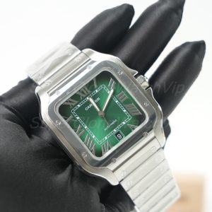
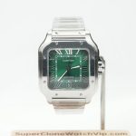
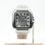
The Santos case already carries a strong identity through its square outline, visible bezel screws, and bracelet-led structure. Consequently, dial color does not work alone. Green adds a deliberate focal point, while black lets the case and bracelet carry more of the design.
The wider Cartier watch collection can help compare Santos with quieter Tank, rounded Ballon Bleu, and other shaped directions. For this article, however, the useful comparison stays with two Santos references that answer different daily-wear needs.
The Better Santos Is the One With the Clearer Weekly Job
The green direction makes sense when color is part of the brief. It should already fit several repeated outfits and remain desirable under normal indoor light. If the attraction depends mainly on bright photography, the role is still unclear.
The black direction makes sense when the Santos shape itself provides enough character. It supports more mixed clothing, yet the dark bezel-and-dial combination can feel more modern and specialized than a classic white or blue Santos.
Neither reference needs an artificial premium ranking. One is color-led, while the other is structure-led. The useful question is whether the weekly wardrobe needs a green focal point or a darker architectural watch.
Still Comparing Round and Shaped Watches?
The Rolex watch collection provides a useful round-case contrast. It can show whether the dial color itself is preferred or whether the Santos square case is creating most of the appeal.
Use the Calendar, Not a Generic Ranking
Which Dial Color Works in Real Daily-Wear Scenarios?
Dial color should solve repeated situations. Office lighting, weekend clothing, travel packing, warm-weather fabrics, and dark winter layers all change the result. A color that performs well in the dominant scene deserves more weight than one perfect special-occasion combination.
Office and Business-Casual Weeks
Black, dark blue, and white all work strongly in office settings. Black keeps the watch controlled, blue adds quiet depth, and white creates a clean traditional center. Green can also work, although deep tones integrate more easily than bright gradients.
Bracelet brightness deserves attention under artificial light. Polished links can make any dial feel more visible. Therefore, a quiet color inside a reflective bracelet may still create more presence than expected.
Casual Weekends and Denim
Blue and green gain freedom during casual wear. Denim, plain T-shirts, overshirts, knitwear, and simple jackets leave enough space for color. Black remains easy, although it may feel more serious than necessary in a relaxed wardrobe.
White feels especially fresh with denim and pale casual layers. However, a highly polished case can move the watch toward dress-casual territory. The case and attachment should support the intended weekend mood.
Dinner, Events, and Dark Evening Clothing
Black usually becomes strongest at night. Lower light reduces visible color changes and lets polished case edges or bracelet surfaces provide controlled contrast. Dark blue follows closely and may appear almost black until the wrist moves.
White becomes more visible against dark sleeves, which can feel crisp and formal. Green depends on shade. Deep green can look rich, while bright green may keep a stronger daytime or expressive character.
Travel With a Small Clothing Rotation
Black is the easiest travel direction because it works with a compressed wardrobe. Dark blue remains almost as flexible, especially when navy, grey, denim, and white form the packing base.
White works well for business trips or warm destinations. Green needs more planning, although it becomes practical when the packed clothing already stays within black, cream, denim, brown, olive, and simple navy.
Warm Weather and Light Fabrics
White becomes especially natural with linen, pale cotton, polos, short sleeves, and neutral trousers. Blue also works well because it adds color without the visual weight of a dark all-black configuration.
Green pairs naturally with cream, khaki, white, and brown. Still, a vivid dial should remain the only strong accent. Black creates clean contrast, yet a large dark case may feel visually heavier during very bright seasons.
Cold Weather and Layered Clothing
Black integrates easily with wool, leather, coats, boots, and darker layers. Dark blue also works across navy, charcoal, camel, and denim, while softer seasonal light can make it appear more restrained.
Green often becomes easier in colder months because brown, olive, burgundy, cream, and textured knitwear support it. White creates a sharp focal point, although that contrast can make the watch appear larger against a dark sleeve.
Fast Scenario Shortcut
Mixed week: black or dark blue.
Polished office week: white, dark blue, or black.
Simple casual week: blue or green.
One visible accent: deep green or a brighter blue.
Color Does Not Sit on the Wrist Alone
Size, Case Shape, Bracelet and QC Can Reverse the Color Decision
A dial color that looks ideal in isolation can fail inside the wrong footprint. The site’s watch size guide explains how case diameter, thickness, lug-to-lug length, bracelet design, and daily comfort work together. For shaped cases, the full outline and first-link spread deserve even more attention.
Bright dials often look larger because the visible surface reaches the edge clearly. Dark dials can visually recede when a contrasting steel bezel contains them. However, a black dial and black bezel may merge into one broad surface and create the opposite effect.
Square Cases Increase the Importance of Color
A square case puts visible material at four corners. Therefore, the eye reads more front area than it might on a round watch with a similar listed width. White can look especially open, green more deliberate, black more architectural, and blue more design-led.
Integrated bracelets continue the geometry around the wrist. As a result, dial color becomes one part of a larger steel object rather than a separate circle. A top view and a side view usually provide more value than diameter alone.
Bracelet Texture Changes the Color’s Formality
A simple three-link bracelet gives black, blue, green, and white a cleaner structure. Smaller multi-link patterns add more reflection, soften the case, and often make the same dial feel dressier.
The Datejust Jubilee vs Oyster bracelet guide develops that difference in detail. Even outside Datejust, its central lesson remains useful: bracelet texture is visible from every angle, while dial color is mainly read from the front.
Use QC to Confirm the Prepared Watch, Not to Invent Certainty
The published QC process covers model confirmation, front and side views, caseback, bracelet or strap, clasp, and visible-detail inspection. For dial color, the most useful additions are neutral-light images and one moving or angled view.
Black needs enough light to reveal printing, hands, dust, and surface condition. Blue needs straight and angled views to show how far it shifts. Green needs the same treatment, while white needs careful checks around numerals, markers, date windows, and polished hands.
QC cannot prove long-term performance, hidden construction, or future durability. However, it can confirm that the prepared watch matches the selected reference, visible color direction, bracelet or strap, and overall condition before dispatch approval.
Straight Front View
Confirms overall tone, printing, marker spacing, hands, date position, bezel relationship, and visible cleanliness.
Angled Neutral-Light View
Shows sunburst lines, gradient edges, gloss, reflection, and whether the color changes more than expected.
Side and Wrist-Scale View
Shows case height, bracelet departure, apparent size, and how the complete watch behaves beyond a close front image.
Marker Style and Date Contrast Can Change the Winning Color
A dial with large Roman numerals does not behave like a clean baton-marker dial. Roman numerals cover more surface and increase visual rhythm, so a white dial may feel traditional while a black dial feels sharper. Green or blue can appear more decorative because the color sits between larger printed or applied elements.
Simple baton markers leave more open space. Therefore, blue and green have more room to show texture, while black can look calmer and white can appear broader. On a minimal dial, even a small shift in color or reflection becomes easier to notice.
The date window also changes the balance. A white date display may blend into a white dial, yet it creates a strong block on black, blue, or green. That contrast can help readability, although it may interrupt an otherwise clean surface.
For that reason, the final comparison should use the exact marker and date layout. A color that works beautifully on a simple no-date face may feel busy when larger numerals, a date opening, and a reflective bezel enter the same front view.
Common Color-Selection Errors
Choosing from one bright photograph. Studio light may increase saturation and reflection. A normal indoor image often provides a better estimate of frequent wear.
Ignoring the bezel. A calm dial beside a colored bezel can be more expressive than a green dial inside a plain steel frame. The complete front view always matters more than the color label.
Assuming dark always looks smaller. A black surface can recede, yet a black bezel and dial can join into one broad shape. Case outline and contrast decide the result.
Matching too literally. A blue dial does not need blue clothing. Visual temperature, brightness, and formality matter more than exact repetition.
Letting novelty replace the wearing role. A strong color should survive several repeated outfits and ordinary light. Otherwise, it may become an occasional watch despite plans for daily use.
Turn the Comparison Into a Shortlist
A Practical Selection and Purchase Path
A useful article should end with a narrower decision, not another open search. The process below keeps the role, model, color, evidence, and order record connected. It also prevents a product page from replacing normal fit and wardrobe checks.
More model and process comparisons appear in the watch guide archive. Still, the active shortlist should remain limited to two or three complete configurations after this stage.
Step 1
Write the Wearing Role
Use one sentence: mixed daily watch, office-to-dinner watch, relaxed color watch, or deliberate accent watch. The sentence should explain why the dial belongs in the week.
Step 2
Select Two Complete Configurations
Compare dial, bezel, case shape, bracelet or strap, and apparent size together. Avoid comparing a green Santos against a black sports watch when the real question is still case family.
Step 3
Set a Rejection Rule
Remove a color that only works under gallery light, needs several new clothing purchases, feels too large in wrist-scale views, or loses readability at normal distance.
Step 4
Confirm Stock and Evidence Scope
Send the product link, color, size direction, bracelet or strap preference, destination, and required QC views through the official contact route before payment.
Who Each Color Direction Fits
Black: a mixed wardrobe, one-watch use, frequent travel, and a preference for low-effort coordination. It also fits a distinctive case that does not need extra color.
Blue: neutral clothing, regular office or casual use, and a wish for visible depth without strong novelty. Dark blue is the most flexible version.
Green: simple clothing, an established neutral option, and a clear preference for the watch to act as the accent. Deep tones support more frequent wear.
White: clean shirts, lighter fabrics, dress-casual clothing, and a preference for clear dial structure. The apparent size should still suit the wrist.
Next Step
Confirm One Main Reference and One Backup
The published order page separates model choice, contact, stock confirmation, payment, QC review, approval, and shipping. The official contact page also lists what information should accompany a model request.
Questions From This Specific Comparison
FAQ: Choosing a Daily Dial Color
Final Shortlist
Choose the Color That Needs the Fewest Exceptions
Black remains the safest direction for mixed wardrobes, travel, and one-watch simplicity. Dark blue offers nearly the same range with more visible depth. White provides clean contrast and works strongly with office or dress-casual clothing. Green creates the clearest identity when neutral outfits leave room for an accent.
The best watch dial color for daily wear should work under normal light, fit several repeated outfits, and remain balanced with the case, bezel, bracelet, and wrist. A short list with one main reference and one backup is more useful than another page of unrelated options.
- Choose black or dark blue when broad weekly flexibility is the main requirement.
- Choose white or green only after checking apparent size, lighting changes, and five normal outfits.
- Before payment, confirm the exact reference, color, attachment, stock status, and required QC views through the official order path.