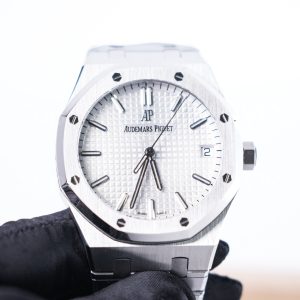
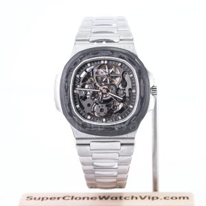
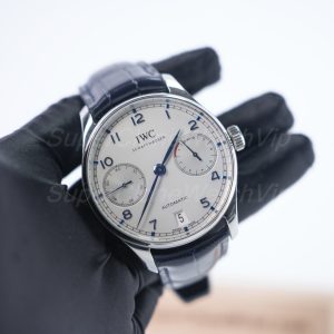
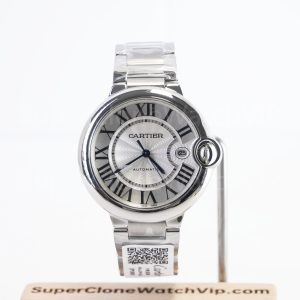
The practical answer to oyster vs jubilee vs integrated bracelet starts with wrist shape and repeated use. Oyster normally feels steady, visually clean, and easy to place. Jubilee usually bends through more points and adds a dressier texture. An integrated bracelet creates the strongest case-to-bracelet flow, although the upper links can make fit more sensitive.
Accordingly, Oyster suits a stable sport-to-office direction. Jubilee fits mixed office, travel, and refined casual wear. Integrated designs work best when case architecture is part of the appeal and wrist measurements are already clear. The sections below compare comfort, visual weight, clothing, sizing, QC evidence, and three real product paths without treating one bracelet as a universal winner.
Quick Navigation
The Practical Answer
Choose the Pressure Pattern Before Choosing the Bracelet Name
Comfort comes from how the watch spreads weight across the upper wrist and clasp area. Bracelet labels suggest a direction, yet the exact case, end links, taper, clasp length, and sizing decide the result.
Stable Daily Direction
Oyster usually works when a planted case, simple link pattern, and restrained sport character matter most.
Flexible Mixed-Use Direction
Jubilee often works when the bracelet should drape easily and move between office and casual clothing.
Design-Led Direction
Integrated bracelets suit a stronger silhouette when the upper-link span and clasp position are carefully checked.
Decision Before Detail
The Fastest Way to Narrow the Bracelet Choice
A bracelet comparison becomes useful only when it removes options. For that reason, the opening decision should describe the desired wrist behavior. A stable watch should remain near the same position during walking, typing, and normal arm movement. A flexible watch can move slightly, yet it should not rotate below the wrist.
Next, the visual role needs a clear limit. Oyster keeps the bracelet pattern simple, so the dial and bezel carry more attention. Jubilee introduces smaller links and more reflections. An integrated bracelet turns the case and bracelet into one continuous shape, which makes the whole outline more noticeable.
Finally, sizing tolerance determines how much risk remains. Oyster and Jubilee options often allow the case to be considered separately from the bracelet. Integrated construction can make the upper bracelet part of the effective case width. As a result, diameter alone provides less certainty.
A broad scan of super clone watches can establish case and bracelet direction. After that scan, the active comparison should return to one use case, one wrist profile, and no more than three coherent configurations.
What Changes on the Wrist
Oyster vs Jubilee vs Integrated Bracelet: Feel, Drape, and Visual Weight
The bracelet changes how a watch occupies space. It also changes how the case moves when the wrist bends. Consequently, the same dial family can feel calm, decorative, or architectural depending on the connection below the case.
Three details deserve attention before appearance takes over. The first is articulation near the case. The second is taper toward the clasp. The third is the location of the clasp beneath the wrist. Together, these details explain more about comfort than the bracelet name alone.
Oyster: Broad Links and a Planted Case
Oyster-style construction normally presents a broad three-link rhythm. In practice, the bracelet looks direct from normal viewing distance. The visual line leaves little decoration between the case and clasp, which keeps attention on the dial, bezel, and case profile.
On a correctly sized wrist, this pattern often feels steady. The broad center path can communicate the case position clearly, so small sizing changes are easy to notice. However, a firm appearance should not become a tight fit. Constant pressure can push the caseback into the wrist and move the clasp away from its natural position.
Flat wrists often support this structure well because the watch has a wider upper surface. Meanwhile, rounder wrists need enough downward movement from the first links. If the end-link area remains too straight, the bracelet can extend outward before wrapping. The watch then appears wider and may rock during movement.
Styling remains one of Oyster’s strongest advantages. A sport bezel feels natural, yet a polished case can also become easier to repeat. The bracelet does not add much visual noise, so a colorful dial or bezel has space to lead. Likewise, a neutral configuration can stay quiet beside plain shirts and knitwear.
Surface treatment still matters. Brushed sections usually reduce glare and support a sport character. Polished center areas create more visibility and can move the same basic link shape toward dress-sport use. Accordingly, the exact product page and QC media should guide the finish judgment.
Oyster is most suitable when stability, simple styling, and predictable sizing carry more weight than decorative flexibility. It also works when the dial or bezel already provides enough personality. However, a very flat visual line can feel severe beside formal clothing, especially when the case is broad and heavily brushed.
Jubilee: More Articulation and More Surface Detail
Jubilee-style construction divides the bracelet into smaller visible sections. As a result, the bracelet bends through more points and breaks reflections into shorter highlights. The case can appear softer because the bracelet transitions away from it through a detailed pattern rather than one broad line.
This articulation often helps on curved wrists. The bracelet can wrap around the side of the wrist without forcing the case into one rigid position. Still, flexibility should not be confused with slack. Too much bracelet length lets the case rotate and can move the clasp toward the edge of the wrist.
Jubilee also changes perceived formality. Smaller links and mixed reflections add detail beside a shirt cuff, a fine knit, or relaxed tailoring. Meanwhile, the bracelet can soften a sport case enough for office use. The same quality may become excessive when paired with a highly decorative dial, strong bezel, and warm-tone case.
A useful balance keeps one element quiet. For example, a neutral dial can support a detailed Jubilee. Alternatively, a strong dial can work when the bezel and case remain restrained. This method avoids stacking every reflective or decorative feature into one configuration.
Skin contact deserves equal attention. Smaller links create more edges and gaps, although the actual feel depends on finishing and movement. A front product image cannot show the underside surfaces. For that reason, clasp, underside, and hanging-bracelet views have practical value during QC review.
Jubilee is most suitable when the same watch must move through office, travel, and refined casual settings. It also helps when a round wrist prefers a bracelet that follows curvature. However, the detailed visual rhythm can make a bold case feel even more noticeable, so the complete configuration needs restraint.
Integrated Bracelet: Case Architecture Continues Onto the Wrist
An integrated bracelet does not look like a separate band attached beneath conventional lugs. Instead, the upper bracelet continues the case shape. Consequently, the watch reads as one designed object from dial to clasp. This continuity creates a stronger identity even when the dial remains simple.
The upper-link angle becomes critical. A bracelet that bends downward soon after the case can settle on a smaller upper wrist. By contrast, a rigid leading section may extend the effective width. The stated diameter then underestimates the complete wrist span.
Taper also shapes the wearing result. Many integrated designs appear broad near the case and narrower near the clasp. As a result, the watch can feel visually substantial above the wrist while remaining lighter underneath. A strong taper also emphasizes the case, which may suit a minimalist dial and clean clothing.
Sizing can require more care because each link may produce a noticeable change. Some designs offer fine adjustment, while others rely mainly on removable links. No general promise applies across every reference. Accordingly, the exact clasp and supplied sizing arrangement need confirmation before the fit is treated as settled.
Integrated bracelets suit square, rounded-square, tonneau, and faceted cases particularly well. The bracelet carries the case geometry into the outfit, so the watch can become the main design element. Simple clothing often supports this result better than heavily patterned layers.
This direction is most suitable when strong design continuity matters more than quiet versatility. It can work daily when the wardrobe already uses clean shapes and limited color. However, uncertain wrist width, narrow cuffs, or a preference for loose sizing can make the decision less forgiving.
Use the Normal Week as the Test
Which Bracelet Fits Office, Travel, Warm Weather, and Daily Rotation?
A polished product photograph shows one controlled moment. Regular wear creates a different test. Sleeves, desk work, walking, heat, travel, and repeated outfits reveal whether the bracelet supports the routine. Accordingly, the most common weekly setting should carry the most weight.
The comparison below avoids a universal ranking. Instead, each scene identifies the pressure pattern and visual role that matter most. A bracelet can perform well outside its strongest scene, although another direction may require fewer compromises.
Office and Smart-Casual Clothing
Oyster works well beside plain shirts, trousers, knitwear, and simple jackets. Its broad links keep the watch direct and reduce decorative competition. Consequently, a stronger bezel or dial can remain wearable without making the full configuration feel busy.
Jubilee fits a softer office direction. Smaller links add texture beside fine fabrics and relaxed tailoring. Meanwhile, the bracelet can make a sport case feel more polished without turning it into a formal dress watch. A neutral dial usually keeps this balance easy to repeat.
Integrated designs need cuff clearance. A broad upper section may catch under a close sleeve, while a lower case profile may pass easily. Accordingly, side views and an existing cuff test matter. Open cuffs, overshirts, and less structured tailoring often provide more room for the architecture.
Travel and Long Seated Periods
During travel, the wrist can feel different after heat, inactivity, or long hours. For that reason, the bracelet should allow slight expansion without becoming loose enough to rotate. Oyster often provides a secure position during movement, especially when the clasp sits centrally.
Jubilee can follow wrist curvature comfortably during long seated periods. However, extra length may let the case slide as the arm changes angle. The target is gentle movement, not constant migration. A stable but uncompressed fit usually works better than a deliberately loose one.
Integrated bracelets require attention to available adjustment. A fit that feels exact in a cool room may become restrictive later. Accordingly, clasp range and spare links should be confirmed. A visually perfect close fit should not replace practical expansion room.
Warm Weather and Extended Wear
Heat increases wrist circumference and moisture. As a result, constant pressure becomes noticeable faster. Oyster can remain comfortable when the bracelet has enough room to move without sliding below the wrist. Brushed surfaces may also appear calmer when the watch receives frequent handling.
Jubilee’s smaller links can feel flexible in warm conditions. Still, moisture and movement may increase the sense of looseness when the bracelet is oversized. Correct clasp position becomes especially important because the case should not pull the bracelet toward one side.
Integrated designs create more contact near the upper bracelet. Smooth undersides and early articulation can spread pressure effectively. Conversely, a broad rigid section may hold heat and resist wrist curvature. An underside image and side profile provide more useful evidence than another frontal close-up.
Dinner, Events, and Refined Casual Wear
Jubilee often fits these settings naturally because its detailed reflections echo polished shoes, fine fabrics, and evening light. However, the rest of the watch should remain controlled. A decorative bracelet, textured dial, and strong warm-tone case can create more visual weight than expected.
Oyster creates a quieter alternative. A clean dial and polished case can look refined while the bracelet maintains a sport foundation. This route suits a preference for understatement and also moves easily back into daytime clothing.
Integrated bracelets can look deliberate with simple evening clothing. The watch becomes an architectural accent rather than a decorative accessory. Accordingly, solid colors and clean lines often provide the strongest match. Busy patterns may compete with the case-bracelet geometry.
One-Watch Rotation
Oyster is usually the easiest neutral route for a one-watch rotation. It can support jeans, polos, shirts, knitwear, and casual jackets without changing character sharply. The bracelet also leaves room for different dial colors and bezel styles.
Jubilee works when the weekly routine includes more office or polished casual clothing. Its texture adds personality to repeated neutral outfits. However, very casual technical clothing may make the bracelet feel dressier than intended, especially when the case and bezel also reflect strongly.
An integrated bracelet can still serve as a daily option when the wardrobe has a consistent design language. Monochrome clothing, clean sneakers, structured outerwear, and simple knitwear support that path. The watch remains specific, yet specificity becomes useful when the same aesthetic appears throughout the week.
Who Each Direction Suits Best
Oyster suits: stable daily wear, straightforward sport styling, restrained office use, and wardrobes where the dial or bezel should lead.
Jubilee suits: mixed office and casual routines, curved wrists, refined textures, and configurations that need a softer transition from the case.
Integrated bracelets suit: design-led wardrobes, strong case architecture, clear wrist measurements, and a preference for one continuous silhouette.
Comfort Is a Geometry Problem
Measure Wrist Shape, Upper-Link Reach, Taper, and Clasp Position
Wrist circumference starts the fit discussion, yet it does not finish it. Two wrists with the same measurement can have different upper widths and side curvature. Likewise, two watches with the same diameter can create different effective spans because their bracelets leave the case differently.
The site’s watch size guide covers case diameter, thickness, lug reach, bracelet style, and daily comfort. The method below applies those points specifically to bracelet architecture.
Use an Existing Watch as the Main Reference
A familiar watch provides better context than a universal wrist chart. Its case width, side height, bracelet drop, clasp position, and comfortable wearing time are already known. This reference lets the new option be compared against a real result instead of an abstract size label.
A top-view photograph can show whether the current case remains inside the wrist edges. A side photograph can show how quickly the bracelet bends downward. Meanwhile, an underside view reveals where the clasp sits and whether one side carries more links.
This comparison does not need a perfect scale photograph. It only needs consistent distance and neutral perspective. The goal is to identify obvious changes in width, height, and bracelet behavior before the shortlist becomes an order.
Flat and Round Wrists Need Different Upper-Link Behavior
A flatter wrist usually offers more horizontal space beneath the case. Oyster can work well because the broad link path follows that surface. Integrated bracelets can also sit effectively when the upper section remains inside the wrist width.
A rounder wrist often benefits from earlier downward articulation. Jubilee may follow the side curve more easily because the links bend through more points. Still, an Oyster bracelet with mobile end links can also work. The exact construction matters more than the general label.
For integrated designs, the first visible bracelet section can behave like an extension of the case. For that reason, a top image should not be judged by case edges alone. The complete upper shape must remain proportionate to the wrist surface.
Clasp Length Can Decide Long-Wear Comfort
The underside of the wrist has a limited flat area. A long clasp can extend onto the wrist curve and create edge pressure. Meanwhile, a short clasp may feel compact but concentrate pressure differently. The ideal result depends on wrist width and link distribution.
Link removal should keep the clasp near the natural center. Removing all links from one side may create the correct circumference while pulling the clasp sideways. Consequently, the case may rotate even though the bracelet is not technically loose.
A slightly off-center clasp can still feel comfortable, so visual symmetry should not become an absolute rule. However, obvious migration toward the wrist edge usually deserves another link arrangement. Comfort should lead when two workable setups exist.
Taper Changes Both Balance and Perceived Size
A strong taper reduces bracelet width toward the clasp. As a result, the upper watch can feel prominent while the underside remains lighter. Integrated bracelets often use taper as part of the design, while Oyster and Jubilee can use it more quietly.
A narrow clasp may suit smaller wrists and refined styling. By contrast, a broader clasp can distribute contact across more surface and support a sport profile. Neither direction guarantees comfort. The existing watch reference can reveal which underside width already works.
Taper also changes the visual transition into clothing. A pronounced taper can look elegant beneath a cuff. A straighter bracelet preserves more sport weight from case to clasp. Accordingly, taper should be considered part of style rather than a hidden technical detail.
Allow Controlled Movement, Not Constant Rotation
A comfortable bracelet should not compress the wrist throughout the day. It should move enough to handle heat and normal bending. However, the watch head should not rotate under the wrist during walking or typing.
A simple test uses three positions: the arm hanging naturally, the hand raised, and the wrist resting on a desk. The case should remain near the upper center without leaving strong pressure in one position. Slight movement is normal, while repeated sliding suggests excess length or uneven distribution.
Visible skin marks do not always prove a poor fit because skin reacts differently. Persistent pinching, numbness, sharp clasp pressure, or frequent rotation provides a clearer warning. Small adjustment changes often solve more than replacing the complete bracelet direction.
Prepare Five Fit Details Before Contact
- Wrist circumference measured without pulling the tape tightly.
- A top-view wrist image or a familiar watch photographed from above.
- The existing bracelet and clasp style that already feels comfortable.
- A preference for planted, gently mobile, or relaxed wear.
- The usual climate, sleeve type, and expected hours of continuous wear.
Three Products, Three Different Reasons
Natural Product Paths for Jubilee and Integrated-Bracelet Wear
The examples below are not a ranking. Instead, they show how bracelet choice interacts with case color, dial strength, and overall architecture. The first path uses steel-tone Jubilee for a travel-sport profile. The second adds a warm-tone case and textured dial. The third shifts into an integrated square-case design.
For a broader comparison that includes quieter Oyster directions, the Rolex replica watches collection keeps GMT-Master II, Datejust, Oyster Perpetual, Submariner, and other model paths together. Current configuration and availability should still be confirmed before an order is recorded.


How the Two Jubilee Paths Differ
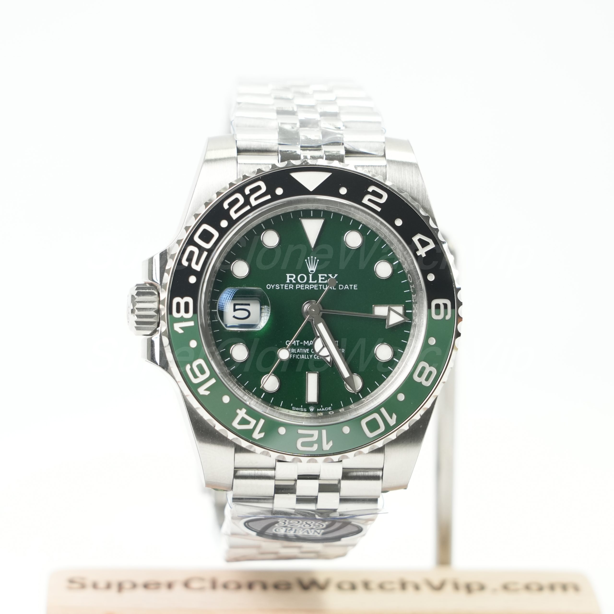
The Sprite keeps the bracelet detailed while the steel-tone case controls the overall weight. Green remains visible through the dial and bezel, yet the configuration can still sit within casual travel and mixed office clothing. Accordingly, the main decision concerns color and left-side layout rather than dressiness alone.
The Tiger Iron path layers more visual elements. The dial texture, warm-tone case, grey-black bezel, and Jubilee bracelet all carry presence. Consequently, this direction needs a deliberate wardrobe match. Plain clothing can support it, while strong patterns may compete with the watch.
Both products show why “Jubilee” cannot answer the full decision. One uses the bracelet to refine a sport-travel configuration. The other uses it as part of a broader statement. Case color and dial character change the practical result as much as the link pattern.
How the Integrated Santos Path Changes the Question
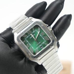
The Santos-style direction places the bracelet inside the case architecture. For that reason, the bracelet cannot be judged as an accessory added later. The square outline, exposed screws, Roman numeral dial, and upper bracelet form one visible system.
A white dial keeps the center visually calm, while the case-bracelet outline carries the identity. This balance can work well with clean shirts, simple knitwear, monochrome outfits, and unstructured jackets. However, the effective width needs more attention than on a conventional round case.
For other square and jewelry-led directions, the Cartier replica watches collection provides a wider visual comparison. The category should be used to confirm whether integrated architecture remains the preference, not to restart the search across unrelated shapes.
A Practical Product Shortlist
Choose the Sprite path when travel-sport styling, steel-tone balance, Jubilee articulation, and green accents all serve the same routine.
Choose the Tiger Iron path when stronger visual presence is intentional and neutral clothing already supports a textured warm-tone configuration.
Choose the Santos path when case geometry and bracelet integration matter more than conventional round-watch neutrality.
Turn Preference Into Verifiable Evidence
What QC Photos Should Confirm About the Bracelet and Clasp
Product images establish the advertised configuration. They do not confirm the exact piece prepared for dispatch. Accordingly, bracelet review should move from general appearance to order-specific evidence before approval.
The published QC process covers model confirmation, front and side views, bracelet, clasp, and visible condition. The checklist below focuses on details that affect this bracelet comparison.
Configuration
Confirm the exact model, bracelet type, dial direction, clasp, and visible case-bracelet connection.
Upper Links
Use angled and side views to check alignment, visible gaps, and how the bracelet leaves the case.
Surface Direction
Review brushing, polished sections, edge lines, and transitions under neutral light.
Underside
Request one clear view of link undersides, clasp shape, hinges, and contact surfaces.
Clasp Action
A short clip can show opening, closing, alignment, and the available adjustment arrangement.
Order Match
Ensure the photographed bracelet and clasp match the saved product link and configuration summary.
Front View: Confirm the Correct Bracelet Before Inspecting Small Details
The first QC image should establish order match. Oyster, Jubilee, and integrated layouts are visibly different, so an incorrect bracelet should be identified before close inspection begins. The dial, bezel, bracelet, and clasp request should describe one configuration.
A straight front image also shows whether the case sits symmetrically between the upper links. Camera tilt can create false asymmetry, so a repeat centered photograph may be more useful than extreme enlargement. The goal is a clear overall relationship, not microscopic perfection.
For Jubilee, the visible link pattern should appear consistent. For Oyster, the broad link lines should remain orderly. For integrated bracelets, the case connection deserves special attention because gaps or uneven transitions affect the complete silhouette.
Side and Angled Views: Check Effective Wrist Span
A side image shows case height and the angle of the upper links. That view helps estimate cuff clearance and effective width. An outward-leading bracelet can occupy more wrist space than a front image suggests.
An angled view also reveals surface transitions. Brushing, polishing, and link edges should be assessed under ordinary light rather than one dramatic reflection. For Jubilee, the smaller center sections become clearer. For integrated designs, the continuous case-to-bracelet line becomes easier to judge.
Static images cannot prove the full articulation range. However, they can reveal whether the upper links appear rigid, misaligned, or unusually extended. A short hanging-bracelet clip may add useful context when fit sensitivity remains the main concern.
Underside and Clasp: Review the Surfaces That Touch the Wrist
The underside receives less attention in product galleries, yet it shapes long-wear comfort. Link edges, clasp hinges, folding sections, and the inner bracelet line should appear orderly. Protective film and light reflections should be distinguished from visible damage.
A clasp image can also support sizing preparation. The clasp length becomes easier to compare with wrist width, while link distribution can be discussed before adjustment. Still, the image cannot guarantee comfort because the actual wrist shape remains part of the result.
A short opening and closing clip can answer a specific question. It may show alignment, hinge movement, and whether the clasp closes consistently. The clip should remain focused. A long rotating video may add less value than one controlled action.
What QC Media Cannot Prove
Photographs cannot prove comfort after eight hours, behavior in heat, hair interaction, or pressure during typing. Likewise, a short video cannot guarantee future articulation or long-term clasp performance. Those limits should remain clear during approval.
The practical purpose of QC is narrower. It confirms the requested configuration, visible condition, link alignment, surface direction, clasp appearance, and the exact piece prepared for the order. Fit confidence then comes from combining that evidence with wrist measurements and a familiar watch reference.
This evidence boundary prevents two opposite mistakes. One is approving the wrong bracelet because the dial looks attractive. The other is requesting endless media for sensations that photographs cannot establish. A focused request creates a cleaner decision.
Three Useful QC Outcomes
Approve: the bracelet, clasp, case connection, and visible condition match the saved configuration.
Request one focused repeat: the configuration is correct, but one side, clasp view, or reflection remains unclear.
Pause: the bracelet type differs, the case connection appears inconsistent, visible damage is unresolved, or the media cannot identify the prepared piece.
Purchase Advice
Common Bracelet Decisions That Look Sensible but Create the Wrong Shortlist
Choosing the Most Flexible Bracelet Without Checking Stability
Flexibility can help a bracelet follow wrist curvature. However, extra articulation does not correct excess length. A loose Jubilee can rotate more than a correctly sized Oyster. Accordingly, the comparison should separate link movement from the final bracelet circumference.
The better test asks whether the watch remains near the upper wrist during ordinary movement. Controlled drape supports comfort. Constant rotation creates repeated adjustment and can make a balanced case feel heavier than expected.
Choosing by Bracelet Name Across Different Case Sizes
A large case on Jubilee may still feel heavier than a smaller case on Oyster. Likewise, a compact integrated design may sit better than a broad round sport case. Bracelet labels cannot remove case width, height, bezel mass, or upper-link span from the decision.
A fair comparison keeps the intended use and case scale close. When the cases differ greatly, the result should be described as a complete-watch comparison. Otherwise, the bracelet may receive credit or blame for a case-geometry issue.
Assuming More Reflection Automatically Means More Formal
Jubilee often looks dressier because it creates more highlights. Still, the bezel, dial, case shape, and color set the final mood. A Jubilee GMT remains a sport-travel watch, while a brushed integrated design can look refined through architecture rather than shine.
Formality should be judged at normal distance beside actual clothing. Close-up reflections can exaggerate surface detail. A configuration that appears highly decorative online may feel balanced when the full outfit remains simple.
Ignoring the Clasp Because It Sits Under the Wrist
The clasp can create more pressure than the upper bracelet. A long clasp may reach the wrist curve, while poor link distribution can pull it sideways. Consequently, a comfortable-looking top view does not complete the fit assessment.
Clasp shape, adjustment arrangement, and link allocation should appear in the final discussion. These details are especially important for integrated bracelets, where one link change can affect both circumference and clasp location.
Using One Studio Image to Judge Bracelet Color and Finish
Direct lighting can make polished areas dominate and brushed areas disappear. Warm exposure can also change the apparent tone of the case and dial. For that reason, neutral-light images should support any finish comparison.
The product page should establish design direction, while QC media confirms the prepared piece. Neither should be stretched beyond its purpose. A front image explains appearance, and an angled image explains surface transitions more clearly.
Treating Integrated Bracelets as Conventional Lug-to-Lug Watches
Conventional lugs create a visible endpoint before the bracelet begins. Integrated cases often blur that boundary. As a result, the upper bracelet can act like part of the case footprint even though it tapers later.
A top image should include the first bracelet sections, not only the square or round case. Side articulation matters equally. This method prevents a moderate diameter from creating false confidence on a narrow upper wrist.
Adding Every Bold Element to Make the Watch Feel More Special
A textured dial, reflective bracelet, warm-tone case, strong bezel, and large size can each look attractive. Together, they may create a configuration that is difficult to repeat. The problem is not quality. It is the absence of one clear visual leader.
A better composition chooses one or two strong elements. For example, Jubilee can lead beside a neutral dial. A textured dial can lead beside a quieter bracelet. An integrated case can lead while the dial color remains simple.
Searching for a Universal Winner
No bracelet wins every wrist, climate, cuff, and wardrobe. Oyster prioritizes visual calm and stability. Jubilee prioritizes articulation and texture. Integrated construction prioritizes design continuity and case-led identity.
The correct result is the bracelet that solves the main weekly need with the fewest fit assumptions. Once that result is clear, product selection becomes shorter. QC requests also become more focused because the important evidence is already defined.
A Shortlist That Leads Somewhere
Use a Five-Step Purchase Method Instead of Browsing Indefinitely
A useful article should end with a smaller decision, not a larger gallery. Accordingly, the bracelet preference should be converted into a short order brief. That brief can be sent with one main product and one backup.
The full replica watch guide archive can answer later model and QC questions. However, more reading should not reopen settled preferences. Each additional page should close one specific gap.
1. Define the Main Scene
Choose office, travel, casual daily wear, events, or design-led use as the main job. Secondary scenes should not reverse that priority.
2. Define Wrist Behavior
Select planted, gently articulated, or architecture-led wear. This choice usually points toward Oyster, Jubilee, or integrated construction.
3. Limit Visual Complexity
Choose which element leads: bracelet, dial, bezel, or case. Keep the remaining elements supportive rather than equally dominant.
4. Compare Two Products
Keep one main configuration and one backup that solve the same use case. Avoid adding unrelated brands or bracelet systems at the final stage.
5. Define QC Evidence
List the exact front, side, upper-link, underside, and clasp views required before approval. Each file should answer one named question.
A concise order brief might state: “steel-tone GMT, Jubilee bracelet, mixed office and travel use, stable but articulated fit, neutral-light dial images, both case sides, bracelet underside, and clasp action.” The backup should preserve the same use case while changing only one meaningful element.
For an integrated direction, the brief might state: “square case, white dial, continuous case-bracelet design, clean office and casual wear, upper wrist width already compared, side articulation and clasp images required.” This wording keeps the order focused on fit and visible configuration.
The active Rolex collection can be used for the final Oyster or Jubilee comparison. Still, only products that solve the same weekly role should remain active. A Submariner, Datejust, and GMT may all look attractive, yet they do not answer the same style question.
Before Contact, Record These Details
The product link, bracelet direction, wrist measurement, normal wearing scene, preferred visual strength, and required QC views should appear in one message. This record reduces confusion between similar models and bracelet options.
Questions Specific to Bracelet Choice
FAQ: Comfort, Fit, Styling, and QC
Final Decision
Choose the Bracelet That Solves the Weekly Routine With the Fewest Assumptions
The final answer to oyster vs jubilee vs integrated bracelet depends on pressure distribution, wrist shape, clothing, and visual priority. Oyster remains the clearest route for stable and restrained daily wear. Jubilee adds articulation and refined texture. Integrated construction creates the strongest design continuity, although upper-link span and clasp position require closer review.
Before an order moves forward, the shortlist should contain one main configuration and one backup. Both should solve the same wearing need. Product links, wrist measurement, bracelet preference, and required QC angles should then appear in one organized message.
- Measure and compare: record wrist circumference, upper wrist shape, and the fit of one familiar watch.
- Choose one visual leader: let the bracelet, dial, bezel, or case carry the main character instead of stacking every bold element.
- Confirm before approval: request the correct bracelet, upper-link, side, underside, and clasp evidence for the exact prepared piece.
Move From Comparison to One Confirmed Configuration
Send the selected product link, wrist measurement, bracelet direction, normal wearing scene, and required QC views. Current configuration and the next order step can then be confirmed through the official contact route.