Do you check the date on your wrist every day, and are you comfortable letting the Cyclops lens become the visual center of the dial? That is the real Datejust vs Oyster Perpetual decision. Datejust gives you the date, stronger visual layering, and more ways to change the watch through bezel and bracelet choices. Oyster Perpetual removes the date display and keeps the face quieter, more symmetrical, and easier to pair with an uncomplicated daily wardrobe.
Start with the Datejust collection when the date is genuinely useful or you want a watch that can move from clean business casual to a dressier configuration. Start with the Oyster Perpetual collection when dial balance, low-effort outfit matching, and a simpler first Rolex-style watch matter more than extra visual features.
Start With the Date Question
A date display is useful only when you actually look at it. If your workday includes appointments, forms, travel dates, or frequent calendar checks, the Datejust earns its extra dial feature. The window at 3 o’clock and the magnifying lens make the date part of both the function and the identity of the watch.
The Oyster Perpetual is the cleaner answer when the phone already handles every date check. Removing the window restores visual symmetry and leaves fewer elements competing with the hour markers. It also removes one model-specific inspection area from the final QC review, although the dial, hands, markers, case, bracelet, and clasp still need to look balanced.
Use this test: imagine the watch on a Monday morning. If seeing the date without reaching for a phone would improve the day, keep Datejust in the comparison. If the lens feels like visual clutter before it feels useful, move directly toward Oyster Perpetual.
The entire comparison in one table
| Decision dimension | Datejust direction | Oyster Perpetual direction | What to verify before choosing |
|---|---|---|---|
| Sizes relevant to this decision | 31, 36 and 41 mm configurations create compact, classic or modern wrist presence. | 36 and 41 mm are the main current daily-wear directions in the collection. | Compare a straight wrist photo, sleeve clearance and how far the case visually reaches across the wrist. |
| Thickness impression | Cyclops, fluted surfaces and a Jubilee bracelet can make the watch feel more layered and visually substantial. | The no-date face and smooth bezel usually create a flatter, cleaner visual impression. | Request a side view; do not judge physical thickness from diameter or a front photo alone. |
| Function | Time plus date, with the date display becoming a central design element. | Time-only layout with fewer interruptions to the dial. | Decide whether the date is used often enough to justify the extra visual and QC complexity. |
| Overall appearance | More architectural, recognizable and configurable. | More symmetrical, direct and minimal. | Compare neutral-dial examples before comparing decorative or brightly colored dials. |
| Bezel and bracelet range | Smooth or fluted bezel effects; Oyster or Jubilee bracelet personalities. | Smooth, softly rounded bezel profile with an Oyster bracelet direction. | Choose bezel and bracelet before dial color because they control the style more strongly. |
| Daily wear | Strong for office, client-facing work, smart casual outfits and dinners. | Strong for denim, knitwear, sneakers, relaxed offices, travel and weekend rotation. | Base the choice on the clothes worn most weeks, not the most formal event of the year. |
| Formality range | Moves from clean business casual to distinctly dressy depending on configuration. | Stays mainly minimal to clean-sport, even when the dial color becomes expressive. | Check shine under normal light, not only bright product lighting. |
| QC difficulty | Date centering, Cyclops position, bezel finish, dial alignment and bracelet consistency. | Dial printing, marker alignment, hand placement, bezel finish and bracelet fit. | Use a straight front image plus side and bracelet views of the exact watch. |
| Best fit | Buyer who needs the date and wants room to tune the watch from restrained to dressier. | Buyer who values symmetry, simple matching and a lower-clutter first watch. | Write one sentence describing the watch’s job before opening product pages. |
Minimal Dial or More Visual Architecture
Oyster Perpetual gives the eye a simple path around the dial: logo, hands, hour markers, and an uninterrupted minute track. That symmetry is especially useful for a first watch because it does not force a strong dress code. A black, silver, blue or other restrained dial can sit quietly under a shirt cuff and still look natural with a T-shirt.
Datejust adds a second visual center at 3 o’clock. The date aperture and Cyclops break the symmetry, but they also create the model’s familiar architecture. This can make the watch feel more complete with structured clothing, especially when the rest of the configuration is controlled.
Do not confuse a no-date dial with an automatically quiet watch. A brightly colored or patterned Oyster Perpetual can be more noticeable than a smooth-bezel Datejust with a neutral dial. The correct order is dial structure first, then dial color. Structure decides whether the face feels simple or layered; color decides how loudly that structure is presented.
You repeat simple outfits, prefer visual symmetry, and want the watch to support the outfit rather than organize it.
The date is useful and you enjoy the interaction between the window, lens, bezel, bracelet and dial markers.
Smooth, Fluted and Domed Bezel Effects
A smooth Datejust bezel reduces visual noise and makes the model easier to wear on ordinary workdays. It keeps the date and Cyclops as the main identifiers while avoiding the stronger light reflections created by a fluted surface. Paired with an Oyster bracelet, it can sit close to the clean-sport end of the scale.
A fluted Datejust bezel adds repeated facets around the dial. Those facets catch light from many angles, so the watch appears dressier and more immediately recognizable even before dial color is considered. This is the better direction when the watch should have a stronger presence with tailored clothing, but it can feel overbuilt beside very casual outfits.
Oyster Perpetual uses a smooth, softly rounded bezel impression that frames the dial without competing with it. The effect is less architectural than a fluted Datejust and more integrated with the case. In practical terms, the bezel lets the dial color and case size do most of the styling work.
QC action: request one straight front photo and one angled photo under normal light.
The front view reveals centering and shape. The angled view shows whether the polished or fluted finish looks even, whether reflections are consistent, and whether the bezel feels proportionate to the dial.
Oyster vs Jubilee Bracelet Personality
The three-link Oyster bracelet gives both models a firmer, cleaner and more casual-business character. On an Oyster Perpetual, it supports the watch’s direct design. On a Datejust, it reduces dressiness and helps a smooth-bezel configuration move closer to a sport-clean daily watch.
The Jubilee bracelet changes the Datejust more dramatically. Its smaller links create more texture and more points of reflection, which softens the case visually while increasing the sense of detail. A fluted bezel with Jubilee sits near the formal end of this article’s style scale; a smooth bezel with Oyster sits much closer to the middle.
Choose the bracelet before choosing a decorative dial. Bracelet texture is visible from across the room and continues around the wrist, while dial details are noticed mainly from the front. For a deeper comparison of link pattern, visual tone and inspection points, use the Datejust Jubilee vs Oyster bracelet guide.
31, 36 and 41 mm Wearing Logic
Diameter changes more than comfort. It also changes how much dial, bezel and bracelet texture the eye receives at once. That is why the same color can look discreet at 31 mm, balanced at 36 mm and much more assertive at 41 mm.
31 mm: compact and intentionally refined
The 31 mm route belongs mainly to Datejust configurations in this comparison. It keeps the watch compact, lets a bracelet behave more like jewelry, and reduces the visual weight of a fluted bezel or decorative dial. It works when a smaller face is a deliberate style choice rather than a compromise.
36 mm: the central reference point, not an automatic answer
Thirty-six millimeters is the safest comparison size because both models can look balanced there. It usually gives enough presence for a clean dial while remaining comfortable under a cuff. Still, it is not universally correct. A very open Oyster Perpetual dial can look larger than its number suggests, while a busy Datejust configuration can feel visually heavier at the same diameter.
41 mm: more dial, more bezel and stronger wrist presence
At 41 mm, a silver or black Oyster Perpetual remains simple but becomes more modern and noticeable. A 41 mm Datejust amplifies every configuration choice: the Cyclops looks more central, a fluted bezel catches more light, and a Jubilee bracelet contributes more texture. Choose this size because you want that presence, not because larger is assumed to be better.
Fit check: request a straight-on wrist photo with the camera centered above the watch.
Check whether the case looks contained within the wrist, whether the bracelet drops naturally from the case, and whether the watch still clears the shirt cuff you wear most often. The broader watch size guide covers case diameter, visual thickness and daily comfort in more detail.
Office Wardrobe and Weekend Flexibility
The useful wardrobe question is not “Which watch is more formal?” It is “How far must one configuration travel between Monday and Sunday?” The answer depends on the combination, not only the model name.
Oyster Perpetual 36 or 41 with a restrained dial is the easiest match for polos, knitwear, overshirts and sneakers.
A smooth-bezel Datejust on Oyster adds a useful date and polished structure without becoming highly dressy.
A Datejust with a fluted bezel or Jubilee bracelet fits more naturally when clothing already includes sharper lines and polished shoes.
Oyster Perpetual asks for the least styling effort. A restrained Datejust can also work, but a highly reflective setup may feel more deliberate than the clothes.
For a one-watch rotation, count the number of days each configuration fits without changing the outfit. The Oyster Perpetual often wins on low-effort frequency. Datejust wins when a date display and a slightly more structured look are useful on most workdays.
Cyclops, Date Window and Dial QC
Datejust creates more date-related inspection work because the eye immediately notices the lens and the number beneath it. Ask for a straight, well-lit close-up with the hands moved away from 3 o’clock. The date should sit visually centered in the aperture, the Cyclops should align with the window, and the magnified number should not appear obviously high, low or shifted to one side.
Also check the relationship between the date opening and nearby markers. A small date misalignment can disturb the entire right side of the dial because the Cyclops enlarges the area. The dedicated Rolex Cyclops lens QC guide explains the front, angled and side views that are most useful.
Oyster Perpetual has fewer date-related concerns, but simplicity makes small dial problems easier to see. Review marker spacing, logo and text placement, hand alignment, dial cleanliness, smooth bezel finish and the way the bracelet meets the case. With fewer decorative elements, one tilted marker can become the strongest feature on the face.
- Straight dial close-up with a clearly visible date
- Angled Cyclops and bezel view
- Side profile and crown side
- Bracelet, clasp and end-link views
- Centered front image for marker symmetry
- Close-up of dial printing and hands
- Angled smooth-bezel view
- Bracelet, clasp and case-transition views
The site’s QC process page shows the broader pre-shipping review sequence. This comparison only adds the model-specific checks needed for Datejust and Oyster Perpetual.
A Minimalist-to-Dressy Decision Scale
Use this as a continuous style scale, not a quality ranking. Moving right adds visual architecture, reflection and formality. The correct position is the one that matches the clothes and settings used most often.
Black, silver or another restrained dial; smooth bezel; Oyster bracelet. Best for symmetry and low-effort daily matching.
More wrist presence, still controlled. Choose Oyster bracelet and a restrained dial to keep the watch casual-business friendly.
Useful date, clear model identity and enough polish for shirts and meetings. Smooth bezel or restrained fluted setup.
Maximum texture and reflection within this comparison. Best when tailored or polished clothing is normal, not occasional.
- Need the date every day? Keep Datejust. Do not need it? Give Oyster Perpetual the advantage.
- Want the dial to remain symmetrical? Stay near level 1 or 2.
- Need a watch for regular shirts, meetings and dinners? Move toward level 3.
- Enjoy strong reflections and detailed bracelet texture as part of normal dress? Level 4 is justified.
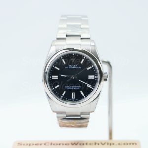
A direct example of the left side of the scale: no date, restrained color, balanced diameter and an Oyster bracelet.
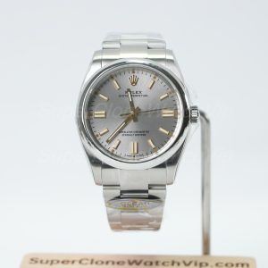
The open no-date layout stays simple, while the larger diameter adds modern wrist presence without adding bezel or bracelet complexity.
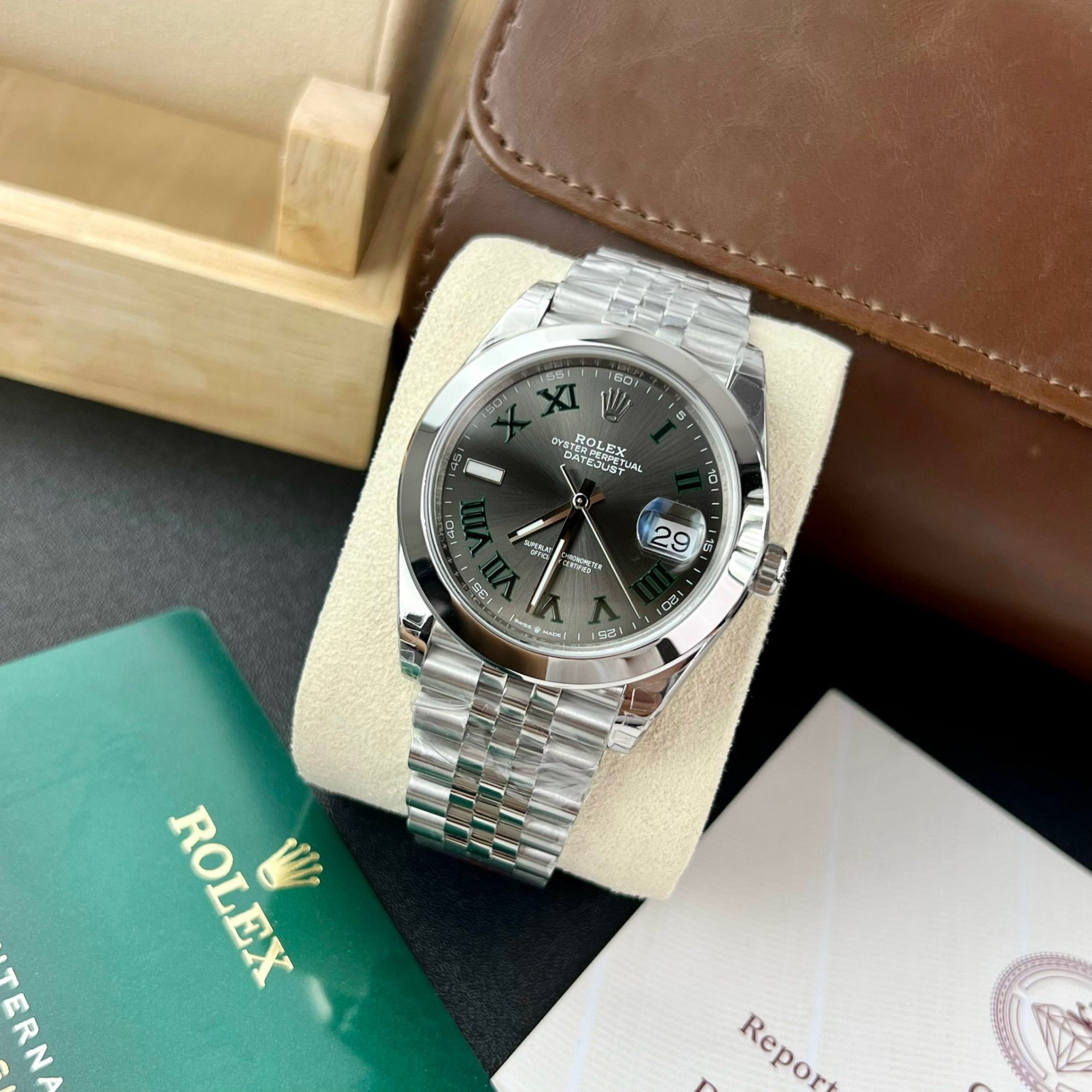
The date and Cyclops add recognizable architecture, while the smooth bezel keeps the overall direction more restrained than a fully fluted setup.
FAQ About Datejust vs Oyster Perpetual
Is the Oyster Perpetual easier to match with casual clothing?
Usually, yes. Its no-date dial, smooth bezel and Oyster bracelet create fewer formal signals, so it works naturally with denim, knitwear, plain shirts, T-shirts and sneakers. A bright or patterned dial can still make an Oyster Perpetual visually loud, so choose a restrained dial when easy matching is the priority.
How much does a fluted bezel change the look?
It changes the watch substantially because the repeated facets catch light around the entire dial. A smooth-bezel Datejust can sit near clean business casual, while a fluted version moves noticeably toward the dressy end, especially when paired with a Jubilee bracelet.
Which model has fewer date-related QC concerns?
Oyster Perpetual has fewer because it has no date window or Cyclops lens. Its QC attention shifts to dial printing, marker alignment, hands, bezel finish and bracelet fit. Datejust requires those checks plus date centering and lens alignment.
Is 36 mm the safest size for both models?
It is the safest comparison point, but not an automatic answer. Thirty-six millimeters gives both models classic balance and comfortable sleeve clearance for many wearers. A broad wrist or preference for stronger modern presence can justify 41 mm, while 31 mm offers a deliberately compact Datejust direction.
Should a first-time buyer choose simplicity or configuration variety?
Choose simplicity when the watch must work with the widest range of ordinary outfits and you do not need the date. Choose configuration variety when selecting the bezel, bracelet and date display is part of the appeal. A first purchase is easier when those choices are made in this order: date, dial structure, bezel, bracelet, then size and color.
Place Yourself on the Scale Before Opening More Tabs
Choose from the scale, not from a tally of advantages. Level 1 points to an Oyster Perpetual 36 with a restrained dial. Level 2 adds size or a clean smooth-bezel Datejust. Level 3 makes the date and business-ready architecture part of daily wear. Level 4 is justified only when fluted reflections and Jubilee texture match the clothes you actually wear.
After locating your level, open no more than two candidate pages and request the same views for both: centered dial, angled bezel, side profile, bracelet and clasp. For Datejust, add a clear date and Cyclops close-up. That side-by-side evidence will resolve the decision faster than another general comparison.
This article stays focused on these two daily-wear directions. Broader replica watches and clone watches research belongs on the main site rather than being forced into this comparison.