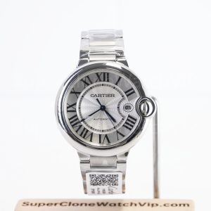
At 7:35 on Monday morning, one wearer buttons a pale-blue shirt, checks a quiet calendar, and wants a watch that disappears neatly under a cuff. Across town, another pulls on a black overshirt and wants the lightning seconds hand and green crystal to be the detail people remember. That is the real Milgauss vs Oyster Perpetual decision: not a contest of technical trivia, but a choice between lowering visual noise and deliberately creating it.
For most first-time buyers who need one watch for work, weekends, and repeated outfits, a neutral-dial Oyster Perpetual is the safer starting point. Choose the Milgauss when its recognisable details are the reason you want the watch, not merely an interesting extra that may become difficult to style later.
Article navigation
Two Personalities, One Wrist: The Real Choice
Both models use a smooth-bezel, three-hand visual language, so the difference can look small in a product grid. On the wrist, the gap is wider. The Milgauss replica turns the seconds hand and crystal into identity markers. The Oyster Perpetual replica lets proportion, dial color, and finishing do the work without asking for constant attention.
In practical Milgauss vs Oyster Perpetual terms, this distinction matters most on a first watch. A first watch usually carries more jobs than a later collection piece: commuting, meetings, dinners, travel, weekends, and clothing changes across seasons. The Oyster Perpetual handles that broad role by staying visually quiet. The Milgauss handles it by being memorable, but only when the wearer is comfortable making the watch part of the outfit rather than a neutral accessory.
The original Milgauss was created around a scientific-tool-watch identity, which helps explain why its visual language feels more specialised than the Oyster Perpetual. That background is useful context, but it should not drive this decision by itself. The practical question is whether the green-edged crystal and lightning-shaped seconds hand fit your normal week. The official Rolex.org Milgauss reference provides the historical context without turning this page into a model-history article.
Lifestyle scorecard: rate the life around the watch
Scores run from 1 to 5 and describe lifestyle fit, not manufacturing quality. For “matching difficulty” and “QC complexity,” a higher number means more effort.
| Lifestyle dimension | Milgauss | Oyster Perpetual | How to use the score |
|---|---|---|---|
| Understatement | 2/5 | 5/5 with black or silver; lower with bright dials | Choose the higher score when the watch should sit quietly with repeated office clothing. |
| Recognisability | 5/5 | 2/5 with neutral dials | Choose the higher score when the seconds hand or crystal should be noticed from across a table. |
| Outfit-matching difficulty | 4/5 | 1/5 with black or silver; 3/5 with vivid dials | A high score suits someone who enjoys coordinating the watch; a low score suits grab-and-go wear. |
| Wrist-size tolerance | 3/5 around the compared 40mm direction | 5/5 with practical 36mm and 41mm directions | The higher score helps when wrist size, sleeve clearance, or preferred presence is still uncertain. |
| QC complexity | 5/5 | 3/5 | Milgauss adds crystal tone and lightning-hand shape to the normal alignment checks. |
Dial Character: Lightning Seconds or Clean Simplicity
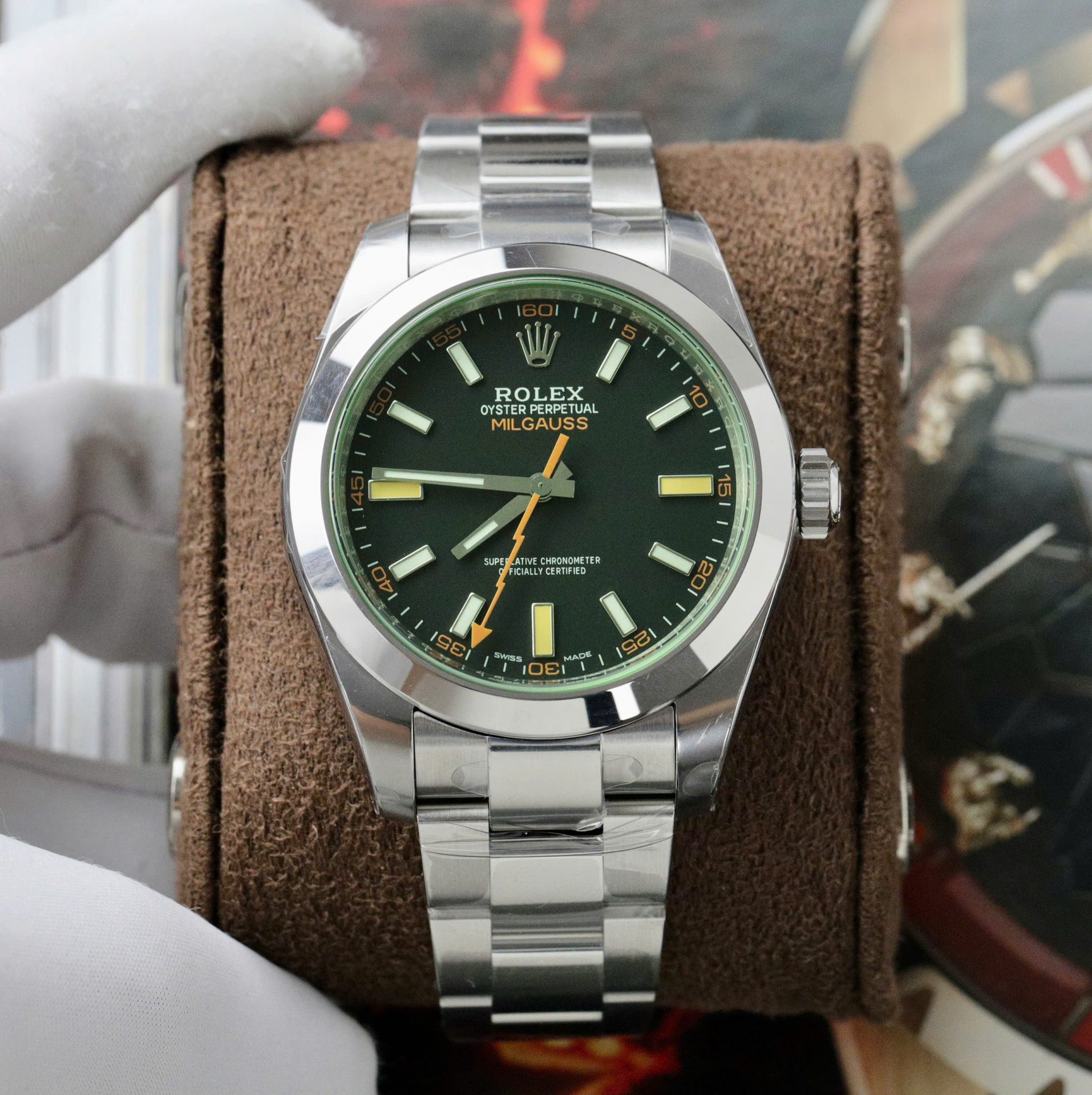
The seconds hand is the fastest way to understand the difference. On the Milgauss, it is not a background component. Its lightning shape and contrasting color interrupt the straight geometry of the hour markers, so the eye keeps returning to it. That makes the dial lively and recognisable, especially with dark clothing or simple outfits that leave room for one strong detail.
The Oyster Perpetual takes the opposite approach. Straight hands, baton markers, a no-date layout, and an open center create an easier reading path. Time can be read without the eye negotiating an extra accent. This is useful in meetings, while commuting, or whenever the watch needs to function as part of a uniform rather than the focus of it.
Choose the Milgauss dial when…
- you enjoy checking the watch even when you already know the time;
- one unusual hand feels more appealing than a perfectly calm dial;
- your wardrobe is mostly neutral and can support a bright accent;
- recognition is part of the purchase goal.
Choose the Oyster Perpetual dial when…
- fast legibility matters more than dial theatre;
- the watch will be worn with patterned shirts, knitwear, or varied colors;
- you prefer details that become noticeable only at close range;
- the first watch must remain useful after the initial excitement fades.
A useful test is to shrink each product photo to the size it appears on your wrist. If the Milgauss still feels balanced when the lightning hand becomes the first thing you see, its character is probably intentional for you. If the detail feels dominant at that smaller scale, the cleaner Oyster Perpetual layout will likely age better in daily use.
Color, Crystal and Visual Attention
Color behaves differently on these two watches. On the Milgauss, color is distributed across the dial, the seconds hand, and the green-tinted crystal effect. Light can make the green edge appear stronger from one angle and quieter from another. The watch may look restrained in a straight-on image, then become much more expressive when the crystal catches side light.
On the Oyster Perpetual, dial color carries most of the visual message. Black and silver are the easiest first-watch choices because they repeat common clothing tones and do not compete with jackets, shirts, or accessories. Blue remains broadly wearable, while brighter or motif dials move the Oyster Perpetual closer to the attention level normally associated with the Milgauss.
Use a three-photo color test before deciding
- Straight-on neutral light: judge dial balance, text, markers, and the base crystal tone.
- Oblique side light: check how strongly the green edge appears and whether reflections hide the hands.
- Normal wrist distance: judge whether the color still supports legibility instead of becoming the whole watch.
Do not approve a Milgauss from one heavily lit image. Camera white balance and reflections can exaggerate or weaken the green effect. Ask for more than one angle under consistent light. For an Oyster Perpetual, request a neutral image that shows whether the dial looks black, silver, blue, or another selected color without a warm or cool color cast.
The current comparison is about visual attention, not about ranking all dial colors. Buyers who already know they want a vivid Oyster Perpetual should treat it as the expressive option it is rather than assuming every Oyster Perpetual is automatically understated.
Case Feel and Everyday Comfort
Diameter is only one part of wrist presence. The compared Milgauss direction is 40mm, but the polished smooth bezel, crystal edge, case side, and energetic dial can make it feel more substantial than the number suggests. That does not mean it is oversized; it means the wearer notices more of the watch at once.
The Oyster Perpetual offers a clearer size choice. A 36mm direction feels compact, traditional, and easier under a cuff. A 41mm direction gives a broader dial and more contemporary presence while keeping the visual language simple. Someone unsure about wrist size has more room to adjust the Oyster Perpetual without changing the basic personality of the watch.
Do not guess thickness from a front-facing catalog photo. Request a side view with the watch lying flat and another on a wrist. Look at case height, how the end links meet the wrist, crown position, bracelet drape, and sleeve clearance. These checks are more useful than comparing isolated diameter numbers.
The table below keeps the Milgauss vs Oyster Perpetual comparison focused on first-watch use rather than turning it into a specification contest.
| Decision area | Milgauss | Oyster Perpetual | Practical meaning |
|---|---|---|---|
| Size direction | Compared product direction: 40mm | Common comparison directions: 36mm or 41mm | Oyster Perpetual gives more room to tune presence without changing the core design. |
| Thickness feel | Visually stronger; side profile deserves separate review | Generally reads cleaner and less visually dense | Use side-view QC rather than relying on diameter alone. |
| Functions | Hours, minutes, seconds; no date in the compared style | Hours, minutes, seconds; no date in the compared style | The decision is mainly visual and ergonomic, not about extra display functions. |
| Appearance | Lightning seconds, green crystal effect, stronger color accents | Straight hands, baton markers, dial color as the main variable | Milgauss creates identity; Oyster Perpetual protects versatility. |
| Bracelet or strap | Compared example is shown on an Oyster-style steel bracelet | Compared examples are shown on Oyster-style steel bracelets | Compare bracelet fit, end links, and clasp; do not assume a strap will change the model’s core personality. |
| Daily wear | More visual energy and more frequent awareness of the watch | Lower attention load with neutral dials | One-watch buyers usually benefit from the quieter option. |
| Formality | Best in smart-casual, creative, or relaxed office settings | Safer for conservative offices and dressier combinations | Wardrobe expectations matter more than model fame. |
| QC difficulty | Crystal tone, lightning-hand shape, dial print, markers, case side | Dial color, marker spacing, hand alignment, bezel, bracelet fit | The simpler dial is not check-free; it simply has fewer model-specific variables. |
| Best suited to | A wearer who wants a recognisable first watch and accepts styling effort | A wearer who wants broad outfit use and easier size selection | Choose by repeated weekly use, not the most exciting isolated photo. |
A practical wrist check is simple: wear a watch of similar diameter for a full workday, including typing, driving, and pulling a sleeve over it. Comfort problems appear during movement, not while posing for a single wrist shot.
Office, Weekend and Smart-Casual Pairing
The most useful wardrobe comparison is not “formal versus casual.” It is how much attention the watch adds to clothing you already repeat. Use the three scenarios below with your real wardrobe rather than an idealised outfit board.
Quiet office
Shirts, knitwear, neutral jackets
A black or silver Oyster Perpetual is the easiest match. It supports clean clothing without adding another color accent. A Milgauss can work, but the orange and green details will be more visible in conservative rooms.
Creative smart-casual
Overshirts, dark denim, textured layers
The Milgauss earns its place here. A simple outfit gives the lightning hand and crystal effect room to act as the deliberate accent. The watch looks expressive without needing a rotating bezel or chronograph layout.
Weekend rotation
T-shirts, denim, travel clothing
Either model works. Choose the Milgauss when the watch should lift a simple outfit. Choose the Oyster Perpetual when comfort, quick matching, and low visual fatigue matter across a long day.
For a first-watch decision, photograph five outfits you actually wore last week. Place the Milgauss and Oyster Perpetual product images beside each outfit. If one model needs an explanation or wardrobe change in three or more cases, it is not the easier daily choice.
Neutral does not mean boring. On a simple Oyster Perpetual, marker placement, dial finish, bezel polish, and bracelet transitions become the points of interest. The value comes from consistency rather than instant novelty.
QC Priorities Unique to Each Model
A generic front photo is not enough for this comparison. The Milgauss needs extra checks because its defining details can change with angle and lighting. The Oyster Perpetual needs disciplined alignment checks because a clean dial leaves fewer elements to distract from small visual errors.
Milgauss: request these separate views
- Full dial, camera level: check printing, marker placement, hand centering, and whether the seconds hand clears the markers cleanly.
- Close-up of the lightning seconds hand: inspect its shape, paint coverage, tip, and mounting point.
- Crystal from two angles: compare the green effect under the same light and look for uneven reflections or distracting distortion.
- Case-side view: judge visual thickness, crown alignment, lug shape, and how the bracelet meets the case.
- Clasp and bracelet: check link condition, brushing, polished areas, end-link fit, and clasp closure.
Oyster Perpetual: keep the simple dial honest
- Neutral dial photo: verify the selected color without strong warm, cool, or saturated lighting.
- Marker spacing and orientation: compare opposite markers and check that the double markers sit evenly where applicable.
- Hand alignment: inspect the hour, minute, and seconds hands separately, including their center stack.
- Smooth bezel and case transition: look for consistent polish, clean edges, and balanced reflections.
- Bracelet fit: inspect end links, brushing direction, clasp alignment, and how the bracelet drapes from the lugs.
Approve the model-specific details before discussing minor preferences. A Milgauss with an unconvincing crystal effect loses the feature that justified choosing it. An Oyster Perpetual with uneven markers loses the visual calm that justified choosing the simpler dial. The site’s QC process explains the pre-shipping review stage; use the lists above to make that review specific to the selected model.
Turn the comparison into a real inspection
Send the exact product link and ask for the angles listed above
Include the model, dial color, preferred size direction, and whether office restraint or visual character matters more. That gives the QC request a clear purpose instead of asking for another generic front photo.
A Five-Question First-Watch Decision Test
Answer each question with yes or no. Do not answer for a future wardrobe or a collection you may build later; answer for the next twelve months of real use.
1. Do you want someone across a table to notice the watch before asking about it? Yes points to Milgauss. No points to Oyster Perpetual.
2. Are most of your weekly outfits office-neutral, formal-leaning, or already patterned? Yes points to a black or silver Oyster Perpetual. No leaves more room for Milgauss.
3. Would the lightning hand and green crystal still be the main reason you want the watch after the novelty period? Yes strongly points to Milgauss. No points to Oyster Perpetual.
4. Do you need the freedom to choose between a compact 36mm direction and a larger 41mm direction? Yes points to Oyster Perpetual. No keeps the 40mm Milgauss direction in play.
5. Are you willing to inspect crystal tone, hand shape, and side profile as separate QC decisions? Yes supports Milgauss. No favors the simpler Oyster Perpetual inspection path.
Read the result without forcing a tie-breaker
Four or five Milgauss answers: the recognisable details are central to your decision, so the Milgauss is unlikely to feel like an unnecessary risk.
Zero or one Milgauss answer: choose a neutral-dial Oyster Perpetual and let size, dial color, and bracelet fit refine the choice.
Two or three Milgauss answers: do not decide from catalog images. Compare the exact QC sets at normal wrist distance and judge which watch requires fewer compromises with your five real weekly outfits.
Compare exact model directions after the test
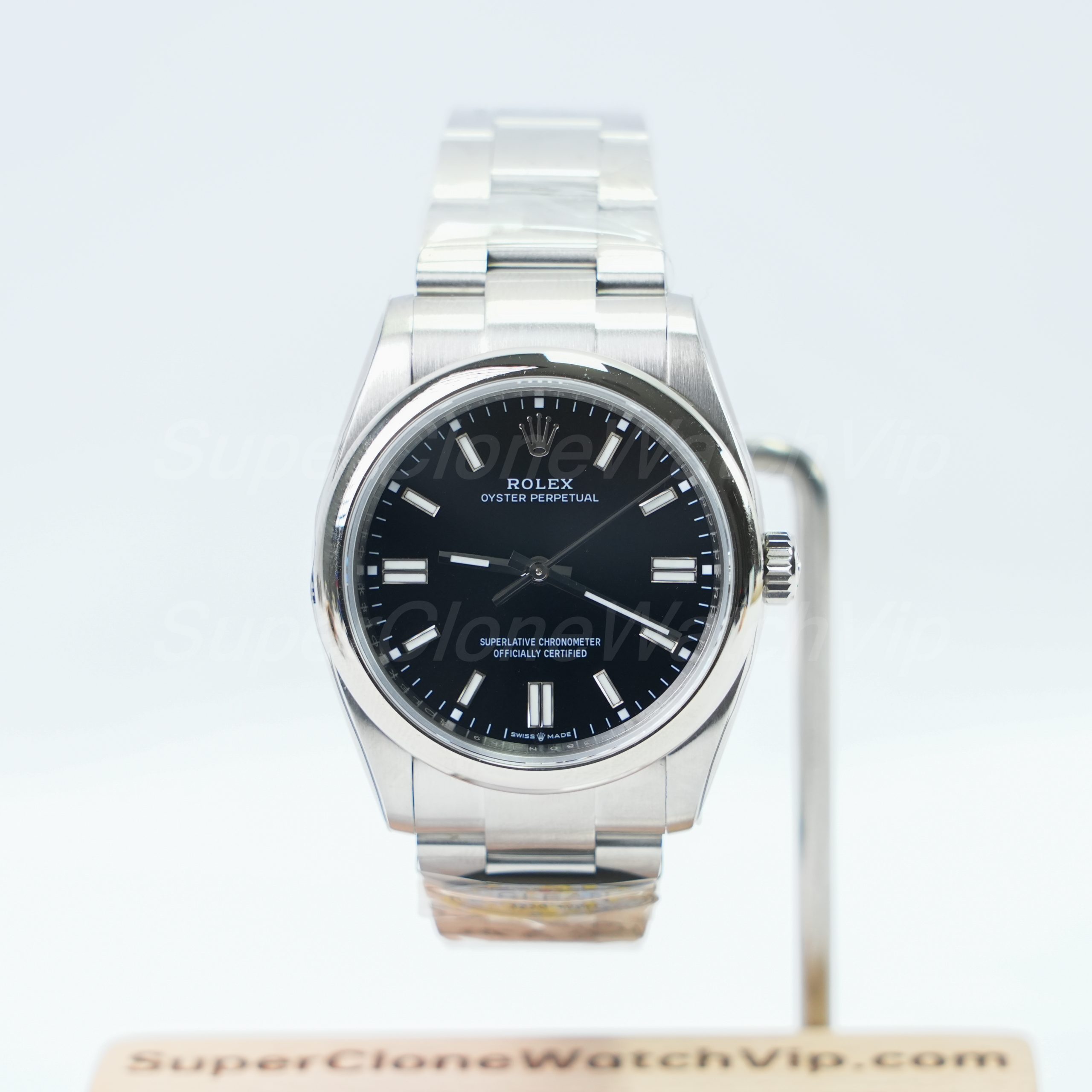
Prefer a larger but still neutral Oyster Perpetual direction? Compare the silver-dial 41mm option. To browse beyond these examples without changing this article’s decision focus, use the main Rolex replica watches category.
Related Reading for Separate Questions
Questions First-Time Wearers Actually Ask
Is the Milgauss too bold for daily office wear?
Not automatically. It works in smart-casual and creative offices, especially with neutral clothing. It becomes harder in highly conservative settings because the orange seconds hand and green crystal effect draw more attention than a black or silver Oyster Perpetual. Judge it against the dress code you follow most days, not the most relaxed day of the week.
Which Oyster Perpetual dial color is easiest to match?
Black is the lowest-effort choice and works with nearly any repeated office or weekend palette. Silver is similarly flexible and feels brighter on the wrist. Blue is still versatile, but it adds more color. Vivid and motif dials should be treated as expressive choices rather than automatically neutral Oyster Perpetual options.
Does the green crystal change how the Milgauss looks in photos?
Yes. The green effect can look stronger at an angle and quieter in a straight-on image. Reflections and camera white balance can also change its apparent intensity. Ask for front, angled, and side-lit photos under consistent neutral light before judging the actual watch.
Which model is safer as a first Rolex-style watch?
A neutral-dial Oyster Perpetual is safer for most first-watch buyers because it offers easier outfit pairing and more practical size directions. The Milgauss is the better first watch only when its lightning hand and green crystal are non-negotiable parts of the appeal rather than details you merely find interesting.
What dial and hand details need separate QC checks?
For the Milgauss, isolate the lightning seconds-hand shape and paint, its center mounting, dial printing, marker alignment, and the way the hands read through the crystal at different angles. For the Oyster Perpetual, check dial color under neutral light, marker spacing and orientation, the center hand stack, and whether the minute and seconds hands track the markers cleanly.
Your next action comes from the five answers
Choose the Milgauss only when visual character wins repeatedly. Choose the Oyster Perpetual when fewer compromises appear across size, clothing, and daily attention.
Then open the exact product page, request the model-specific QC angles, and compare the watch at normal wrist distance. That final check tests the same variables this page is built around instead of restarting the decision with another generic pros-and-cons list.