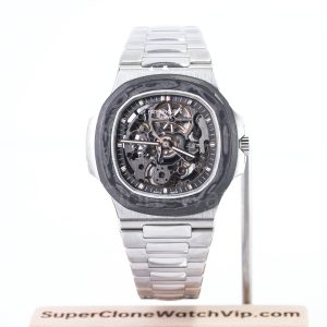
The best Patek Nautilus super clone 5711 5712 7118 decision separates three buyers immediately: choose 5711 for a clean time-and-date layout, 5712 for an asymmetric complication dial, or 7118 for a smaller case presence with stronger dial character. The reference comes first because it determines what should be compared in photos, which functions need proof and how much visual complexity you will see every day.
Within the broader replica watches catalogue, this page is a reference-selection guide rather than a general factory ranking. It narrows the choice by wrist proportion, dial balance, bracelet behavior and reference-specific QC evidence, then sends factory questions to the dedicated comparison only when they become relevant.
Three Nautilus References, Three Different Buyers
The references share the rounded-octagonal Nautilus outline, horizontal dial treatment and integrated case-to-bracelet idea, but they do not create the same wearing experience. The 5711 depends on restraint. The 5712 uses intentional imbalance and several displays. The 7118 reduces the overall footprint and lets the dial pattern and bracelet read more like a compact piece of jewelry.
Do not begin with dial color or a factory label. First decide how much case you want on the wrist, whether you will use or simply enjoy the additional displays, and how many reference-specific checks you are prepared to review before approval.
5711: Simplicity, Thinness and Bracelet Focus
The 5711 is the most direct choice when the appeal is the Nautilus silhouette itself. Its uncluttered dial gives the bezel, case ears, side profile and integrated bracelet nowhere to hide. This is why a cleaner reference is not automatically an easier approval: fewer elements mean the eye notices a heavy case, an uneven date, a tilted logo or a stiff first bracelet link more quickly.
Choose it for visual calm, not because it has fewer checks
A 5711 direction works well for office use, restrained evening wear and buyers who want one dial that remains legible from a distance. The strongest selection action is to compare a straight front photo with a true side profile. From the front, check the horizontal texture, marker spacing, hand length, logo position and date frame. From the side, judge whether the bezel, mid-case and caseback read as one controlled stack rather than a thick block.
Bracelet evidence matters just as much as the dial. Ask for the watch laid flat and hanging naturally so the first links can be seen in two states. The transition should not look forced, and the clasp should close evenly without one side sitting higher.

5712: Asymmetry, Complications and Function QC
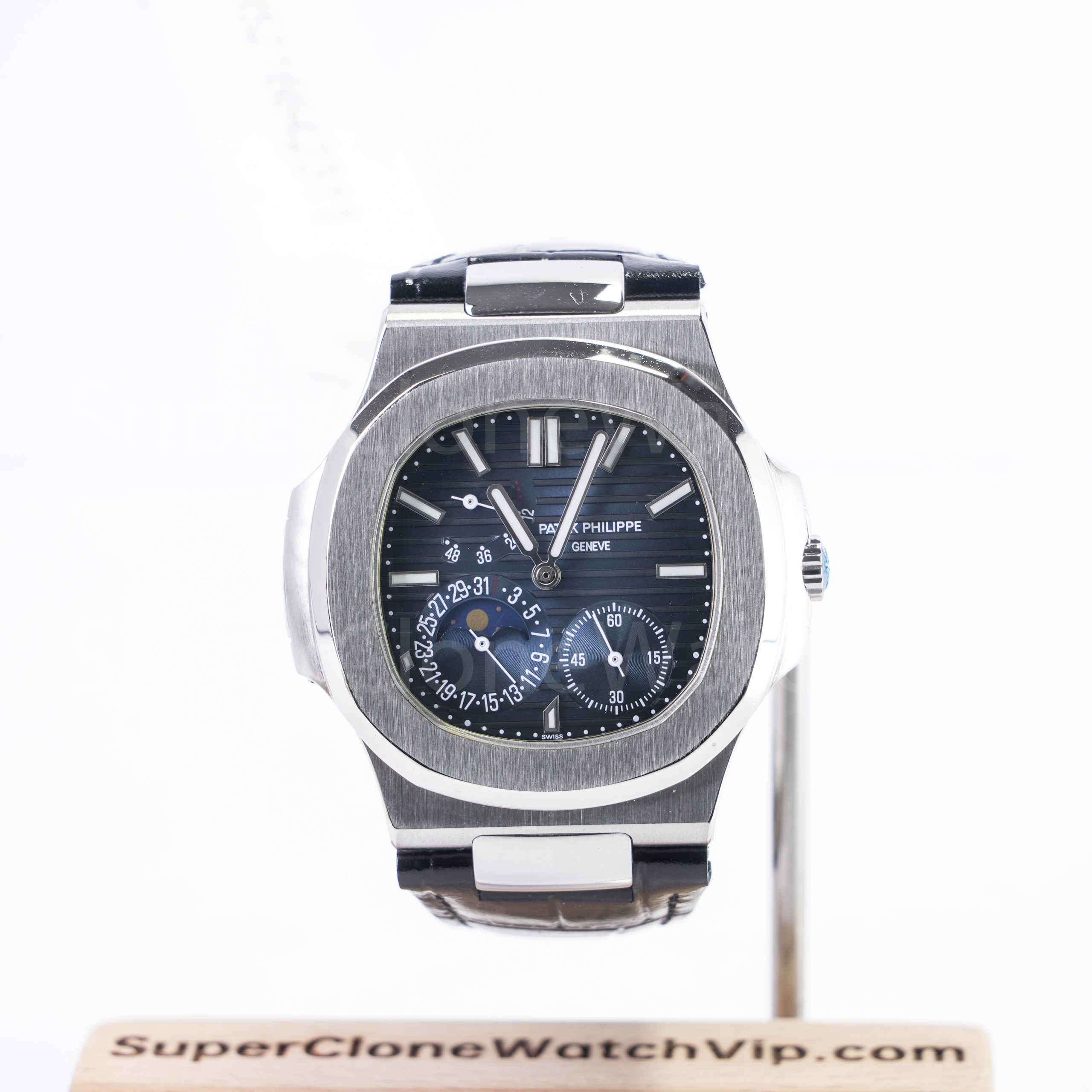
The 5712 is chosen because the dial is not quiet. Its moonphase area, power-reserve scale, small-seconds display and pointer-date arrangement create an asymmetric composition that should look deliberate rather than crowded. The buyer therefore has two separate jobs: inspect the spacing and printing as visual details, then confirm which displays on the offered version are active and how they are adjusted.
Static photos judge layout; video judges behavior
Use a centered dial image to compare the relationship between sub-displays, the moonphase aperture, markers and hands. A slightly angled glamour photo can make spacing look more generous than it is. Request close views at more than one hand position so a hand is not permanently covering important print.
Function proof should be specific. Ask the seller to identify the active displays for the exact current version and provide a short demonstration of setting or advancing them where practical. Do not assume that every 5712-style version behaves identically, and do not approve only because the caseback looks attractive. The front-dial behavior, crown operation, case thickness and strap or bracelet fit remain the useful evidence.
7118: Smaller Proportions and Dial Character
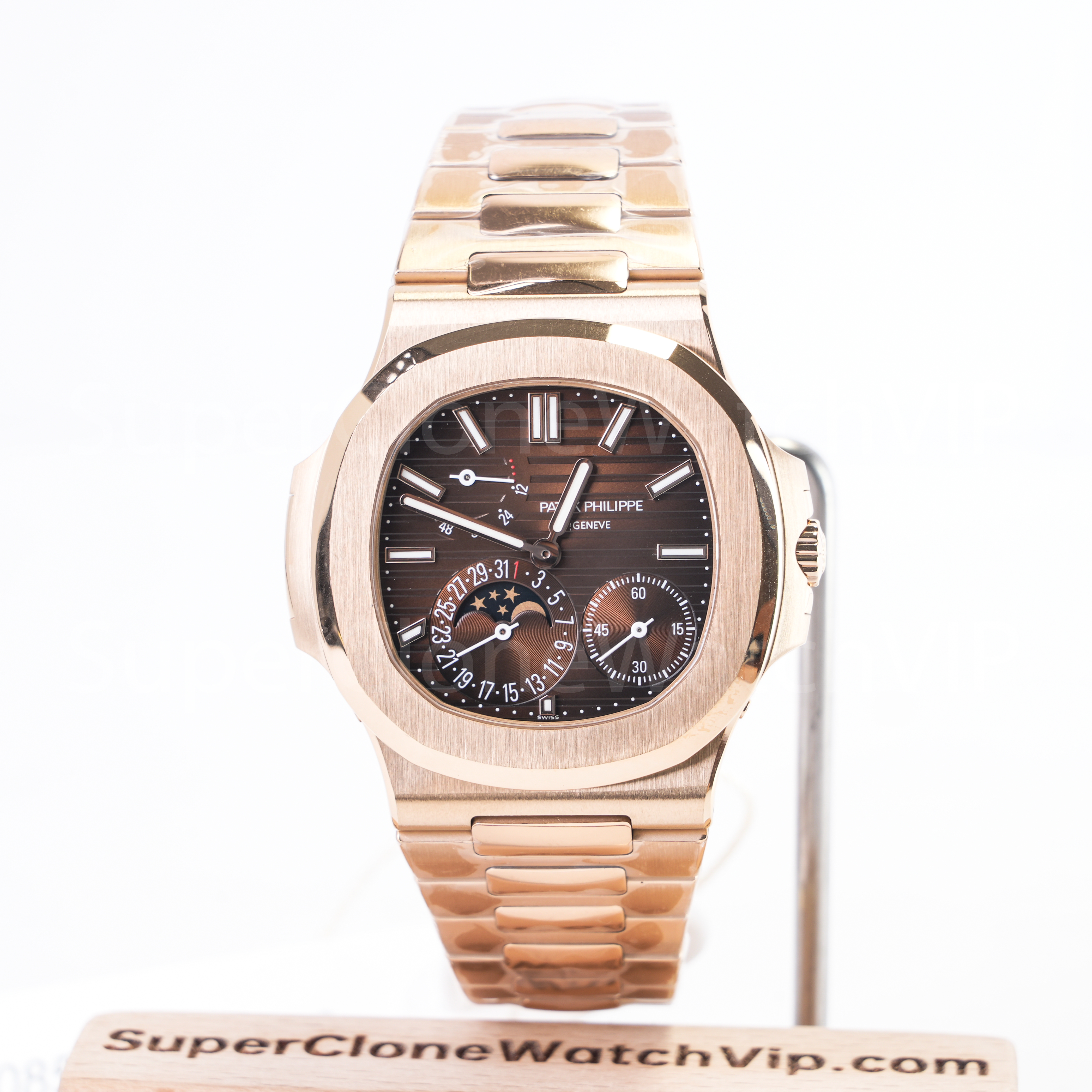
The 7118 is not simply a reduced 5711. Its smaller case direction changes how the bezel, dial, bracelet and color occupy the wrist, while its more decorative horizontal pattern gives the face a different rhythm. Current 7118 listings on the site use a 35.2 mm case direction, so this reference deserves a separate wrist-fit decision rather than being grouped under the 40 mm product examples.
Consider it when a full-size Nautilus extends too far across the wrist, when the bracelet should read more delicately, or when the dial color is meant to be part of the outfit rather than a neutral background. The selection is not restricted by gender. The useful test is whether the smaller bezel-to-dial relationship and shorter bracelet span look intentional on the intended wearer.
What to request before accepting the smaller reference
- A straight front photo that shows the wave-like dial pattern, applied markers and date window without perspective distortion.
- A wrist or sizing photo with the bracelet closed, because loose links can make a compact watch appear larger.
- A side image showing crown scale, crystal height and how the first bracelet link leaves the case.
- A clasp close-up and a bracelet-back photo to check finishing consistency at the smaller scale.
Do not borrow 40 mm evidence for a 7118 decision
Confirm the exact 7118 color, bracelet configuration and current version first, then request prepared-watch QC images that show the smaller case on the intended wrist. A 5711 or 5712 product photo cannot prove 7118 fit or dial scale.
Factory and Version Questions by Reference
Factory labels used across clone watches should enter this conversation only after the Nautilus reference is fixed. Ask for the current version attached to the exact configuration, because a comment about one 5711 dial or one 5712 movement setup should not be transferred automatically to another reference, material direction or production update.
Ask for 5711
Current version name, case-profile photos, dial and date close-ups, bracelet or strap configuration, clasp images and any version-specific changes visible on the offered piece.
Ask for 5712
Current version, active function list, adjustment method, dial-layout photos, caseback fit, case thickness and a function demonstration where available.
Ask for 7118
Exact listed size, dial color, bracelet configuration, current maker or version information and images that show the compact case next to the closed bracelet.
For 5711 and 5712 only, open the dedicated PPF vs 3KF Nautilus guide after confirming the exact reference and current version. That page should handle the deeper factory comparison; this guide keeps the decision centered on 5711, 5712 or 7118.
Budget should be applied at this stage, not at the beginning. Compare the current quote for the exact reference, material direction and version, then decide whether the added complication or finish is worth the extra QC work. Avoid using an old price as evidence that one factory or reference is automatically better.
QC Evidence Required for 5711, 5712 and 7118
Prepared-watch evidence should answer a reference-specific question. A large folder of repeated front images is less useful than a short, deliberate set that proves proportion, alignment, finishing and operation.
Evidence required for every reference
- Centered front: dial, logo, markers, hands and date shown without a tilted camera.
- Both side profiles: bezel stack, crown side, opposite ear, crystal height, caseback and first-link angle.
- Bracelet and clasp: front, back, open and closed views, plus a short movement clip.
- Dial under two lights: neutral daylight and normal indoor light for color and texture comparison.
- Operation video: crown handling, time setting, date change and any reference-specific functions offered.
- Identity note: exact reference, dial, bracelet or strap, current factory/version label and prepared-watch confirmation.
Add for 5711
A close date-window image, ideally with more than one date value when available; a true flat side profile; and a hanging-bracelet clip that reveals first-link behavior.
Add for 5712
Close-ups of each display with the hands moved away from critical print, plus a demonstration of the active functions and their adjustment sequence.
Add for 7118
A closed-bracelet wrist or sizing view, a macro view of the dial pattern and markers, and a side image that keeps the smaller case and first link in one frame.
The site’s QC photos before shipping page explains the general approval sequence, while video proof before shipping is the next step when still images cannot show bracelet movement or function behavior.
Choose by Wrist, Function and Visual Balance
Use the three filters in order. Wrist proportion removes the references that do not sit correctly. Function preference decides whether the 5712 earns its extra complexity. Visual balance decides whether you prefer the clean 5711 dial, the asymmetric 5712 composition or the smaller 7118 with stronger dial character.
Reference routing before you request QC
- Choose 5711 when the wrist supports a full Nautilus presence, the complication displays are unnecessary and you are willing to scrutinize case slimness, date alignment and bracelet flow.
- Choose 5712 when the asymmetric dial is the reason for buying and you accept the highest QC burden: layout, active functions, adjustment behavior and case profile.
- Choose 7118 when a compact footprint is the first requirement and dial color, bracelet scale and centered wrist fit matter more than full-size sports-watch presence.
Before sending a request, write one line that names the reference, intended wrist or wearer, preferred dial color, bracelet or strap direction and the exact evidence required. That prevents a 5711 photo set from being used to answer a 5712 function question, or a 40 mm product image from being used to judge a 7118 fit decision.
FAQ
Which Nautilus reference is simplest for daily wear?
The 5711 is the simplest starting point because its time-and-date layout stays clear and restrained. Approval still requires careful case, date and bracelet checks, since the clean dial makes proportion and alignment issues easier to notice.
Why does 5712 require more functional QC?
Its dial contains several displays, so appearance alone is not enough. Confirm which functions are active on the exact offered version, how they are adjusted and whether a short video can demonstrate their behavior without assuming every version works the same way.
Who should consider the smaller 7118?
It suits a wearer who wants a compact case, shorter bracelet span and a more decorative dial presence. Judge it by wrist centering and bracelet scale rather than treating it as a gender-only choice.
How should dial color be compared across photos?
Request the same watch in neutral daylight and normal indoor light, with one straight image and one shallow angle. Compare the metal case or bracelet too; a large change in metal tone signals that camera white balance is also shifting the dial color.
When should the PPF vs 3KF guide be opened?
Open it after choosing 5711 or 5712 and confirming the current version under discussion. It is not the first step for a 7118 decision, and it should not replace prepared-watch QC evidence.
Send One Reference-Specific QC Request
A full-size wrist preference with no need for complications points to 5711. A strong interest in the asymmetric displays, plus tolerance for the most detailed function review, points to 5712. A smaller wrist footprint and compact visual balance point to 7118. Name that reference first, then request only the photos and video that prove its case, dial, bracelet and functions.